Lower South Providence leans heavily Democratic by roughly 40 points: about 70% of voters vote Democratic and 30% Republican. These figures are model estimates: Rhode Island did not have precinct-level voting records available for training, so the numbers above come from demographic and health features rather than local ground truth.
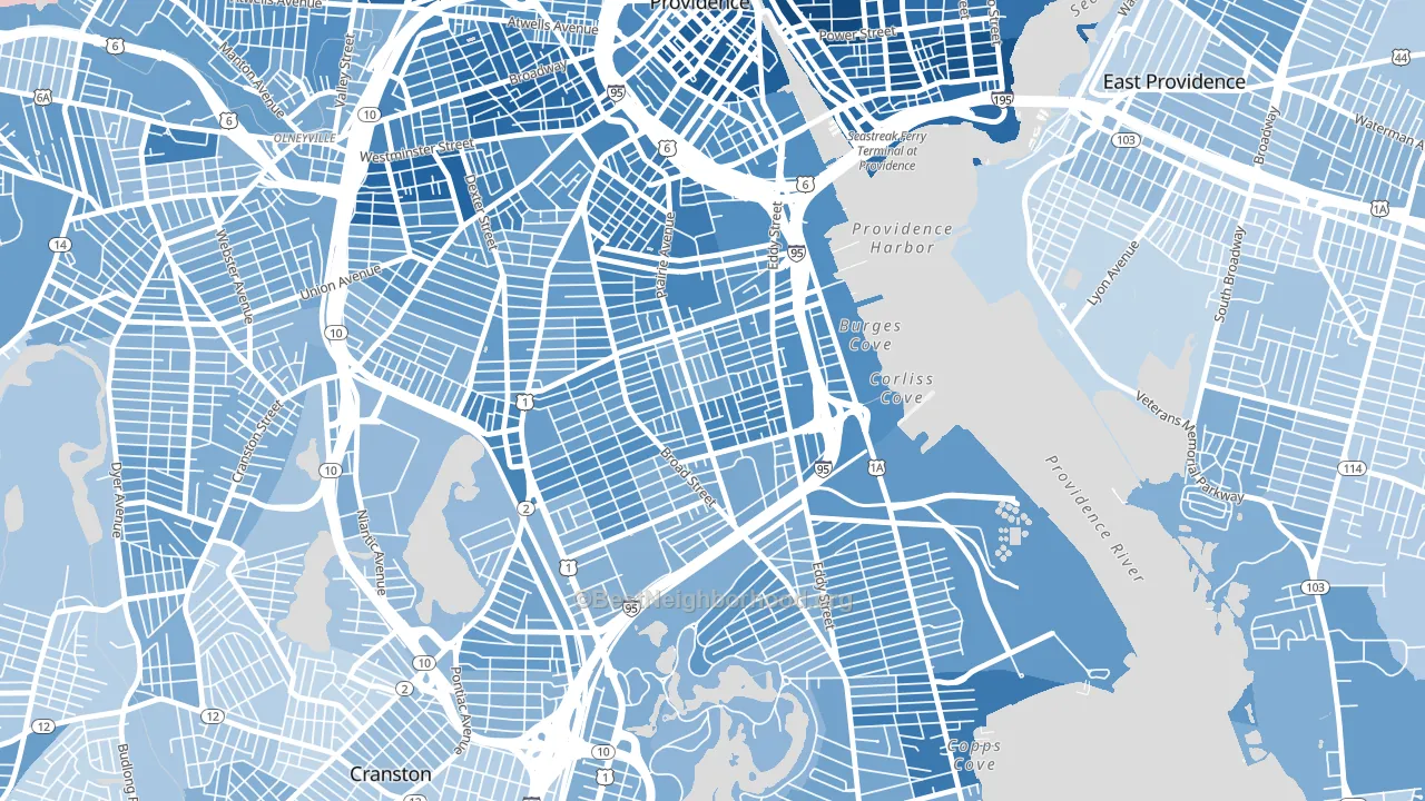
About 34% of adults in Lower South Providence typically vote, below the U.S. average of about 62%. Among adults in Lower South Providence, ~24% vote Democratic, ~10% Republican, and ~66% don't vote. The map below shows estimated turnout by block group.
How Lower South Providence compares
Among neighborhoods within 5 miles, Lower South Providence leans more Democratic than 21 of 36 neighbors.
Lower South Providence runs about 25 points more Democratic than Rhode Island as a whole.
Politics vary noticeably by block within Lower South Providence. The north side is the most Democratic-leaning (D+49) and the southwest side is the least Democratic-leaning (D+33), a spread of about 17 points.
Why Lower South Providence leans the way it does
Density, race composition, education, and family structure all sit close to their national averages in Lower South Providence. None of them point strongly toward either party.
Preventive-care access and voter turnout
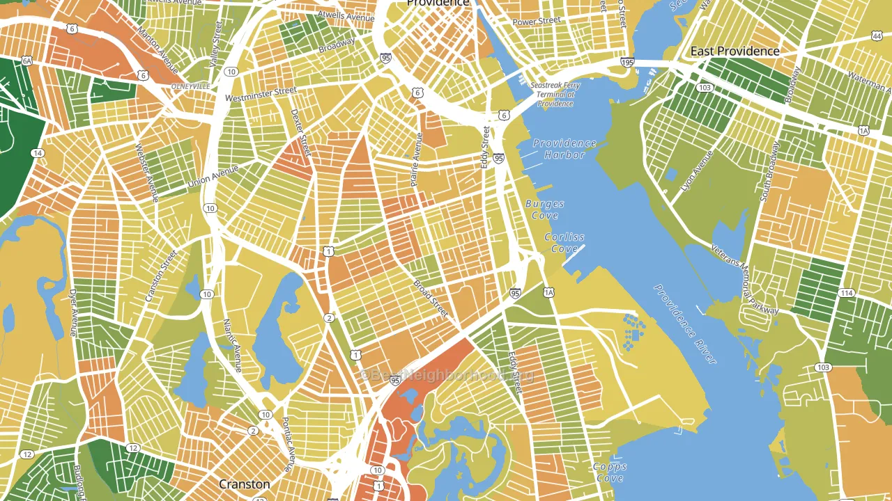
Places with limited routine preventive-care access tend to turn out at a lower rate; Lower South Providence, Providence, RI sits in the bottom quarter nationally on this measure. Dental visits do not drive turnout; the rate reflects income, insurance, and healthcare access, which line up with who votes.
Why turnout in Lower South Providence looks the way it does
Areas with limited routine healthcare access turn out at lower rates. Lower South Providence is in the bottom quarter nationally for routine-care measures such as insurance coverage, preventive screenings, and dental visits. The dental-visit rate here is about 48%, about 22 points below the Rhode Island average of 70%. Renters vote less often than owners, and about 66% of households in Lower South Providence rent, about 41 points above the U.S. average of 25%. High food insecurity lines up with lower turnout, and about 43% of adults in Lower South Providence report food insecurity, above 96% of neighborhoods. Learn more about the findings and methodology on the political spectrum map.
Nearby Neighborhoods
- Elmwood, Providence, RI D+39
- Upper South Providence, Providence, RI D+46
- Wayland, Providence, RI D+40
- Washington Park, Providence, RI D+39
- West End, Providence, RI D+48
- Reservoir, Providence, RI D+22
- South Elmwood, Providence, RI D+28
- Downtown, Providence, RI D+64
- Federal Hill, Providence, RI D+60
- Fox Point, Providence, RI D+75
Neighborhoods with Similar Populations
- Century City, Los Angeles, CA D+42
- Delta, Everett, WA D+16
- Pelican Bay, Naples, FL R+23
- East Gloucester, Gloucester, MA D+16
- Bird Land, San Diego, CA D+32
- Central Street Merchant District, Evanston, IL D+77
- Columbia Forest, Arlington, VA D+51
- Shaw, St. Louis, MO D+75
- Southwest Area, Cedar Rapids, IA D+21
- Royal Highlands, Brooksville, FL R+46
Sources and methodology
Precinct-level voting records used to fit the model come from Rhode Island Board of Elections, distributed by the Voting and Election Science Team. Demographic inputs come from the U.S. Census Bureau (ACS 5-year estimates and the 2020 Decennial Census). Health and environmental inputs come from the CDC (PLACES and the Environmental Justice Index). Land cover comes from the USGS and EPA. Election-day and lead-up weather come from PRISM 4km daily grids and the NOAA Global Historical Climatology Network. Mail-voting and election-administration patterns come from the MIT Election Lab's Survey of the Performance of American Elections. Block-group crime detail comes from CrimeGrade. Internet data and modeling support provided by ISPreports.org.
Modeling and analysis by the BestNeighborhood data science team. RI did not have precinct-level voting records available for training, so the figures here come from extrapolation across demographic, health, and land-use features rather than local ground truth. Full methodology and findings: political spectrum map.
Methodology reviewed by the BestNeighborhood data team. Last updated May 2026.