Mendocino County leans Democratic by roughly 24 points: about 62% of voters vote Democratic and 38% Republican.
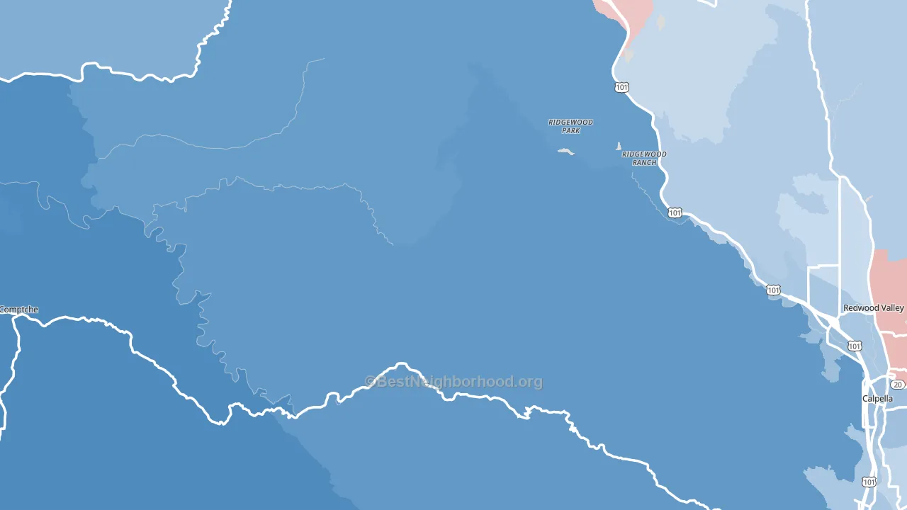
About 65% of adults in Mendocino County typically vote, near the U.S. average of about 62%. Among adults in Mendocino County, ~40% vote Democratic, ~25% Republican, and ~35% don't vote. The map below shows estimated turnout by block group.
How Mendocino County compares
Politically, Mendocino County sits close to the rest of California.
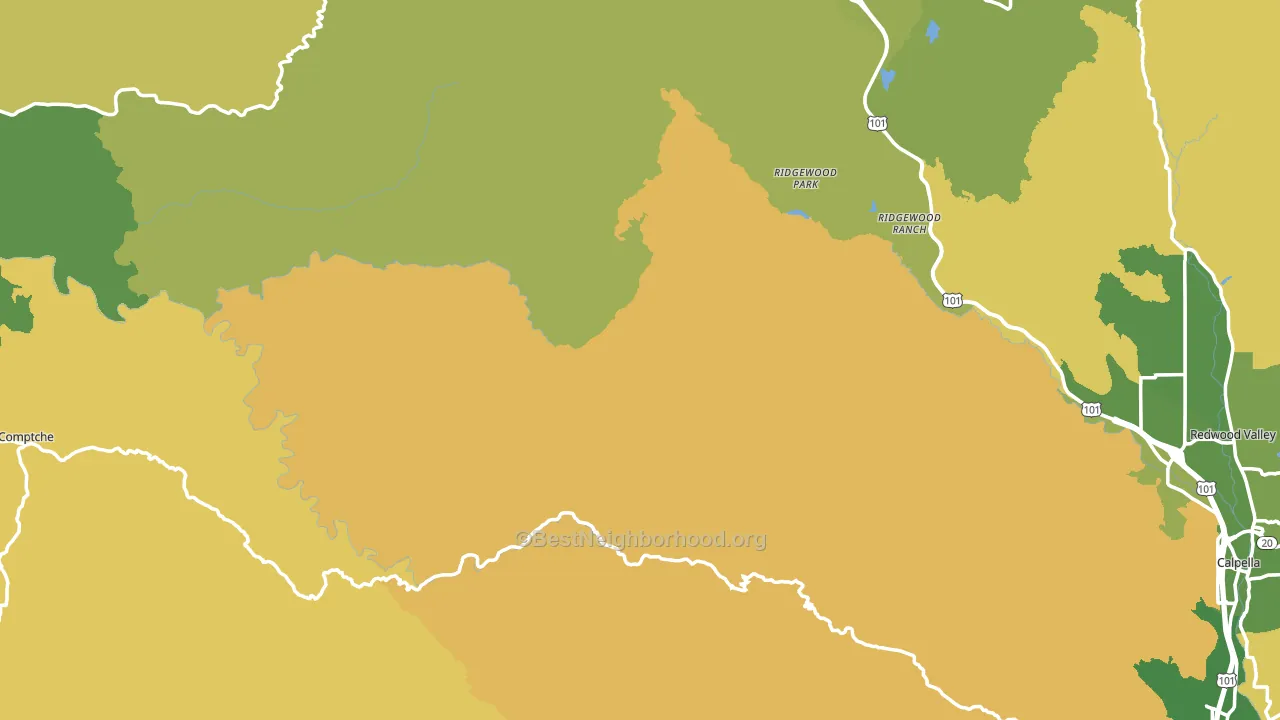
Politics vary noticeably by city within Mendocino County. The southwest side runs the most Democratic (D+54) and the east side runs the most Republican (Even), a spread of about 54 points.
Why Mendocino County leans the way it does
This analysis examined 14,881 data points per county to find what predicts political lean and turnout. The items below are a few correlations that stood out for Mendocino County, not a ranked or complete list of what matters most.
Areas with many never-married adults vote Democratic. About 33% of adults in Mendocino County have never been married, above 77% of counties.
Paved land cover and Democratic lean
Places with extensive paved surfaces tend to lean Democratic; Mendocino County, CA sits above the national average on this measure. Paved ground does not change how people vote; it mostly reflects how urban and built-up a place is.
Why turnout in Mendocino County looks the way it does
Turnout in Mendocino County sits close to the national pattern. Routine healthcare access, homeownership, education, and food security all land near their national averages here. Learn more about the findings and methodology on the political spectrum map.
Nearby Counties
- Lake County, CA R+4
- Glenn County, CA R+32
- Sonoma County, CA D+42
- Colusa County, CA R+20
- Tehama County, CA R+35
- Napa County, CA D+32
- Butte County, CA R+3
- Trinity County, CA R+14
- Sutter County, CA R+23
- Marin County, CA D+48
Counties with Similar Populations
- Liberty County, TX R+50
- Northumberland County, PA R+39
- Ozaukee County, WI R+7
- Frederick County, VA R+25
- Victoria County, TX R+28
- Wayne County, NY R+23
- Grafton County, NH D+18
- St. Clair County, AL R+65
- Rockingham County, NC R+31
- Madison County, KY R+26
Sources and methodology
Precinct-level voting records used to fit the model come from California Secretary of State, Elections, distributed by the Voting and Election Science Team. Demographic inputs come from the U.S. Census Bureau (ACS 5-year estimates and the 2020 Decennial Census). Health and environmental inputs come from the CDC (PLACES and the Environmental Justice Index). Land cover comes from the USGS and EPA. Election-day and lead-up weather come from PRISM 4km daily grids and the NOAA Global Historical Climatology Network. Mail-voting and election-administration patterns come from the MIT Election Lab's Survey of the Performance of American Elections. Block-group crime detail comes from CrimeGrade. Internet data and modeling support provided by ISPreports.org.
Modeling and analysis by the BestNeighborhood data science team. Full methodology and findings: political spectrum map.
Methodology reviewed by the BestNeighborhood data team. Last updated May 2026.