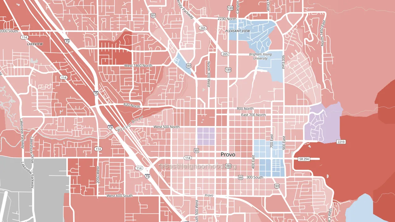
North Park leans Republican by roughly 16 points: about 42% of voters vote Democratic and 58% Republican.
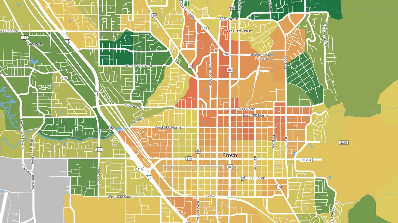
About 37% of adults in North Park typically vote, below the U.S. average of about 62%. Among adults in North Park, ~16% vote Democratic, ~21% Republican, and ~63% don't vote. The map below shows estimated turnout by block group.
How North Park compares
Among neighborhoods within 5 miles, North Park leans more Republican than 6 of 14 neighbors.
North Park runs about 6 points more Democratic than Utah as a whole.
Why North Park leans the way it does
This analysis examined 14,881 data points per neighborhood to find what predicts political lean and turnout. The items below are a few correlations that stood out for North Park, not a ranked or complete list of what matters most.
North Park votes Republican even though it is densely developed (more than 99%, far above the Utah average of 32%). State and regional patterns outweigh the Democratic lean that density usually predicts here.
Cancer-screening access and voter turnout
Places with low colon-cancer-screening access tend to turn out at a lower rate; North Park, Provo, UT sits in the bottom quarter nationally on this measure. Cancer screening does not drive turnout; it reflects income, insurance, and healthcare access.
Why turnout in North Park looks the way it does
Renters vote less often than owners. About 85% of households in North Park rent, about 60 points above the U.S. average of 25%. Crowded housing lines up with lower turnout, and about 7% of homes in North Park have more than one occupant per room, above 85% of neighborhoods. Learn more about the findings and methodology on the political spectrum map.
Nearby Neighborhoods
- Dixon, Provo, UT R+14
- Joaquin, Provo, UT R+9
- Carterville, Provo, UT R+15
- Franklin South, Provo, UT R+10
- Tree Streets, Provo, UT R+3
- Provost, Provo, UT R+14
- Lakeview North, Provo, UT R+24
- Westmore, Orem, UT R+18
- Provo South, Provo, UT R+16
- Lakeview, Orem, UT R+18
Neighborhoods with Similar Populations
- Stockton, Camden, NJ D+53
- Emerald Hills, San Diego, CA D+45
- Tri-South, Columbus, OH D+58
- Greendale, Worcester, MA D+27
- La Plaza, San Bernardino, CA D+27
- South Campus, Madison, WI D+51
- Bryte, West Sacramento, CA D+8
- Old Saginaw City, Saginaw, MI D+35
- Cortez-Stege, Richmond, CA D+66
- Pheasant Run, Aurora, CO D+15
Sources and methodology
Precinct-level voting records used to fit the model come from Utah Lieutenant Governor's Office, Elections, distributed by the Voting and Election Science Team. Demographic inputs come from the U.S. Census Bureau (ACS 5-year estimates and the 2020 Decennial Census). Health and environmental inputs come from the CDC (PLACES and the Environmental Justice Index). Land cover comes from the USGS and EPA. Election-day and lead-up weather come from PRISM 4km daily grids and the NOAA Global Historical Climatology Network. Mail-voting and election-administration patterns come from the MIT Election Lab's Survey of the Performance of American Elections. Block-group crime detail comes from CrimeGrade. Internet data and modeling support provided by ISPreports.org.
Modeling and analysis by the BestNeighborhood data science team. Full methodology and findings: political spectrum map.
Methodology reviewed by the BestNeighborhood data team. Last updated May 2026.