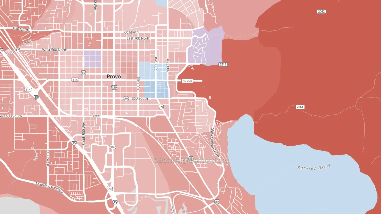
Provost leans slightly Republican by roughly 14 points: about 43% of voters vote Democratic and 57% Republican.
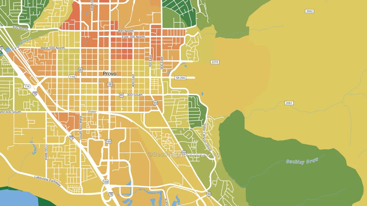
About 60% of adults in Provost typically vote, near the U.S. average of about 62%. Among adults in Provost, ~26% vote Democratic, ~34% Republican, and ~40% don't vote. The map below shows estimated turnout by block group.
How Provost compares
Among neighborhoods within 5 miles, Provost leans more Republican than 3 of 9 neighbors.
Provost runs about 8 points more Democratic than Utah as a whole.
Why Provost leans the way it does
This analysis examined 14,881 data points per neighborhood to find what predicts political lean and turnout. The items below are a few correlations that stood out for Provost, not a ranked or complete list of what matters most.
Car-dependent areas vote Republican. About 81% of residents in Provost drive to work alone, about 7 points above the U.S. average of 74%. A high family-household share predicts Republican voting, and about 81% of households in Provost are family households, above 87% of neighborhoods.
Cholesterol-screening access and voter turnout
Places with low cholesterol-screening access tend to turn out at a lower rate; Provost, Provo, UT sits in the bottom tenth nationally on this measure. Cholesterol screening does not drive turnout; it reflects income, insurance, and healthcare access.
Why turnout in Provost looks the way it does
Turnout in Provost sits close to the national pattern. Routine healthcare access, homeownership, education, and food security all land near their national averages here. Learn more about the findings and methodology on the political spectrum map.
Nearby Neighborhoods
- Provo South, Provo, UT R+16
- Tree Streets, Provo, UT R+3
- Joaquin, Provo, UT R+9
- Franklin South, Provo, UT R+10
- North Park, Provo, UT R+15
- Dixon, Provo, UT R+14
- Carterville, Provo, UT R+15
- Lakeview North, Provo, UT R+24
- Westmore, Orem, UT R+18
- Lakeview, Orem, UT R+18
Neighborhoods with Similar Populations
- Rosebank, Nashville, TN D+20
- Midtown Savannah, Savannah, GA D+71
- Westside, Syracuse, NY D+37
- Smith Homes, Greensboro, NC D+85
- Presidents Park, Parlin, NJ R+10
- Homestead Park, Homestead, PA D+62
- Crescent Area Historic District, Plainfield, NJ D+43
- Tarrytown, Gary, IN D+82
- Downtown Juneau, Juneau, AK D+50
- Garden-Villa Montery, San Jose, CA D+33
Sources and methodology
Precinct-level voting records used to fit the model come from Utah Lieutenant Governor's Office, Elections, distributed by the Voting and Election Science Team. Demographic inputs come from the U.S. Census Bureau (ACS 5-year estimates and the 2020 Decennial Census). Health and environmental inputs come from the CDC (PLACES and the Environmental Justice Index). Land cover comes from the USGS and EPA. Election-day and lead-up weather come from PRISM 4km daily grids and the NOAA Global Historical Climatology Network. Mail-voting and election-administration patterns come from the MIT Election Lab's Survey of the Performance of American Elections. Block-group crime detail comes from CrimeGrade. Internet data and modeling support provided by ISPreports.org.
Modeling and analysis by the BestNeighborhood data science team. Full methodology and findings: political spectrum map.
Methodology reviewed by the BestNeighborhood data team. Last updated May 2026.