Park Slope is a Democratic stronghold. About 89% of voters here vote Democratic and 11% Republican.
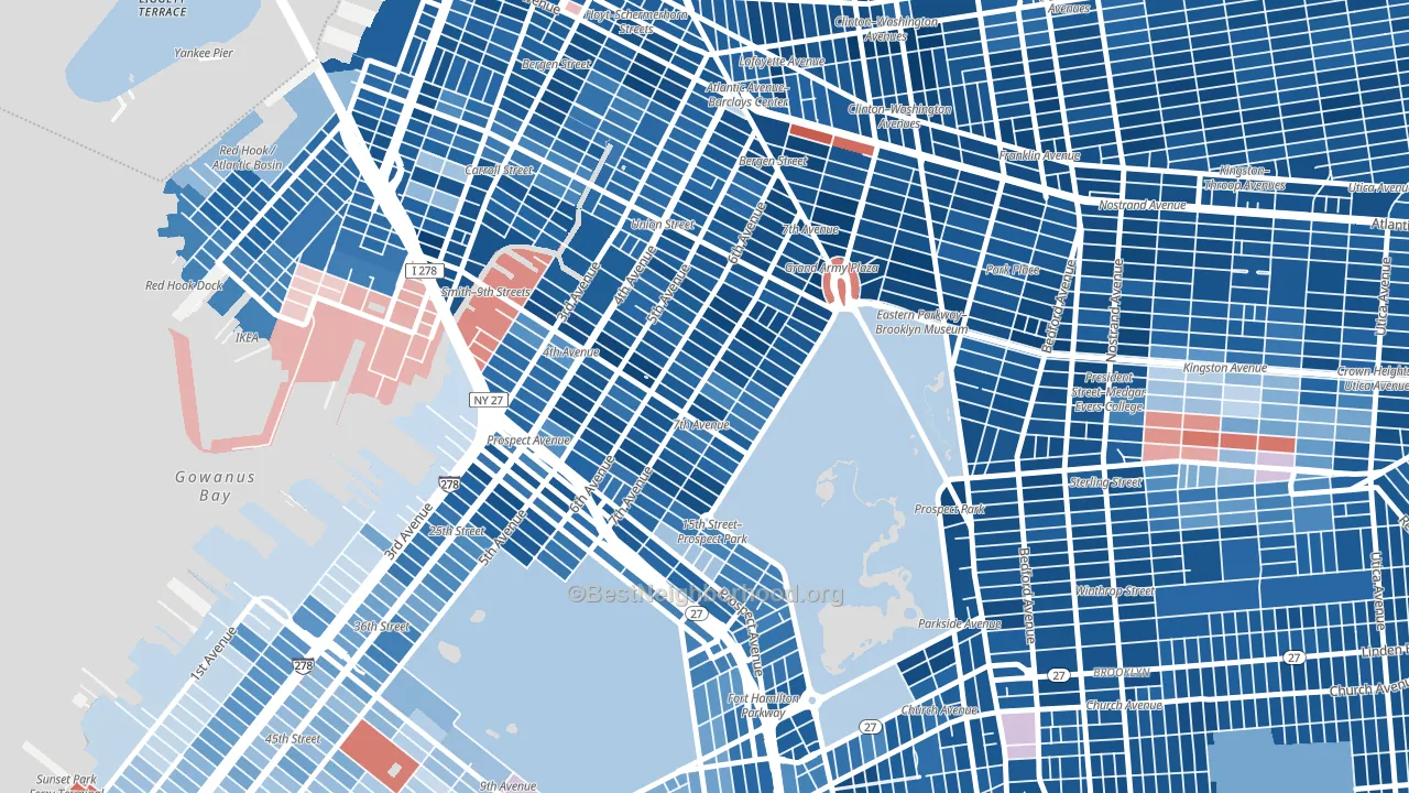
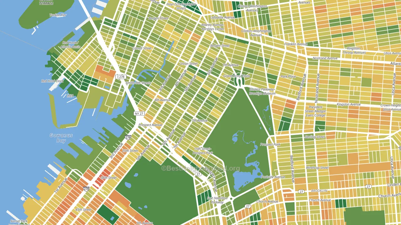
About 68% of adults in Park Slope typically vote, above the U.S. average of about 62%. Among adults in Park Slope, ~61% vote Democratic, ~7% Republican, and ~32% don't vote. The map below shows estimated turnout by block group.
How Park Slope compares
Among neighborhoods within 5 miles, Park Slope leans more Democratic than 39 of 46 neighbors.
Park Slope runs about 66 points more Democratic than New York as a whole.
Politics vary noticeably by block within Park Slope. The northeast side is the most Democratic-leaning (D+87) and the south side is the least Democratic-leaning (D+62), a spread of about 25 points.
Why Park Slope leans the way it does
This analysis examined 14,881 data points per neighborhood to find what predicts political lean and turnout. The items below are a few correlations that stood out for Park Slope, not a ranked or complete list of what matters most.
Dense areas vote Democratic. More than 99% of residents in Park Slope live in densely developed areas, about 64 points above the U.S. average of 36%. High college attainment predicts Democratic voting, and Park Slope sits in the top quarter (about 81%, above 97% of neighborhoods).
Paved land cover and Democratic lean
Places with extensive paved surfaces tend to lean Democratic; Park Slope, Brooklyn, NY sits in the top tenth nationally on this measure. Paved ground does not change how people vote; it mostly reflects how urban and built-up a place is.
Why turnout in Park Slope looks the way it does
Areas with strong routine healthcare access turn out at higher rates. Park Slope is in the top quarter nationally for routine-care measures such as insurance coverage, preventive screenings, and dental visits. The dental-visit rate here is about 74%, about 14 points above the U.S. average of 60%. Learn more about the findings and methodology on the political spectrum map.
Nearby Neighborhoods
- Greenwood, Brooklyn, NY D+62
- Carroll Gardens, Brooklyn, NY D+74
- Boerum Hill, Brooklyn, NY D+77
- Fort Green, Brooklyn, NY D+78
- Red Hook, Brooklyn, NY D+62
- Prospect Lefferts Gardens, Brooklyn, NY D+84
- Cobble Hill, Brooklyn, NY D+79
- Columbia Street Waterfront District, Brooklyn, NY D+78
- Crown Heights, Brooklyn, NY D+59
- Downtown Brooklyn, Brooklyn, NY D+79
Neighborhoods with Similar Populations
- Willow Glen, San Jose, CA D+37
- Soundview, Bronx, NY D+47
- Queens Village, Queens, NY D+50
- Mott Haven, Bronx, NY D+47
- Downtown San Jose, San Jose, CA D+47
- Boyle Heights, Los Angeles, CA D+43
- Ridgewood, Queens, NY D+20
- Central Phoenix, Phoenix, AZ D+41
- Galleria-Uptown, Houston, TX D+13
- Far Northeast, Humble, TX R+21
Sources and methodology
Precinct-level voting records used to fit the model come from New York State Board of Elections, distributed by the Voting and Election Science Team. Demographic inputs come from the U.S. Census Bureau (ACS 5-year estimates and the 2020 Decennial Census). Health and environmental inputs come from the CDC (PLACES and the Environmental Justice Index). Land cover comes from the USGS and EPA. Election-day and lead-up weather come from PRISM 4km daily grids and the NOAA Global Historical Climatology Network. Mail-voting and election-administration patterns come from the MIT Election Lab's Survey of the Performance of American Elections. Block-group crime detail comes from CrimeGrade. Internet data and modeling support provided by ISPreports.org.
Modeling and analysis by the BestNeighborhood data science team. Full methodology and findings: political spectrum map.
Methodology reviewed by the BestNeighborhood data team. Last updated May 2026.