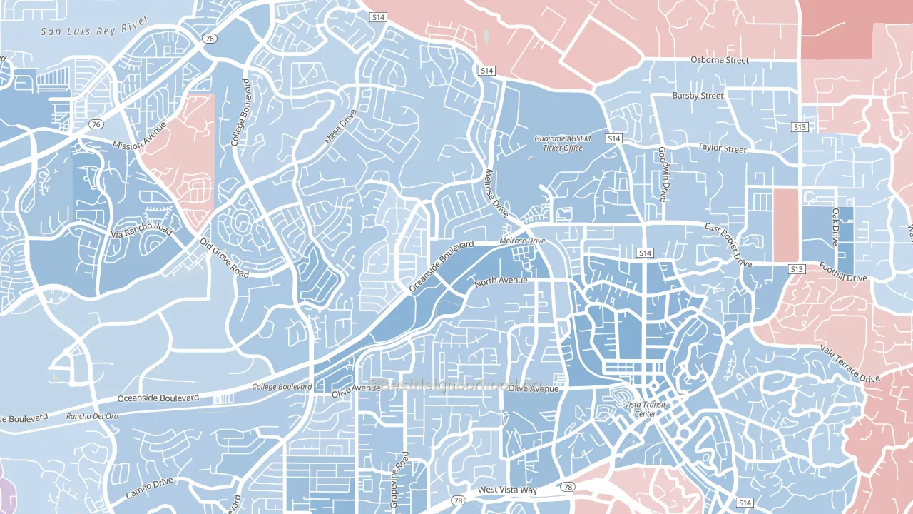
Peacock leans slightly Democratic by roughly 10 points: about 55% of voters vote Democratic and 45% Republican.
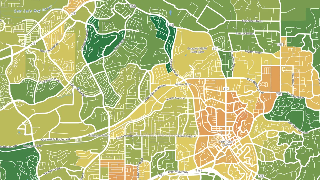
About 52% of adults in Peacock typically vote, below the U.S. average of about 62%. Among adults in Peacock, ~29% vote Democratic, ~23% Republican, and ~48% don't vote. The map below shows estimated turnout by block group.
How Peacock compares
Among neighborhoods within 5 miles, Peacock leans more Democratic than 3 of 6 neighbors.
Peacock runs about 10 points more Republican than California as a whole.
Politics vary noticeably by block within Peacock. The southwest side is the most Democratic-leaning (D+17) and the west side is the least Democratic-leaning (D+5), a spread of about 12 points.
Why Peacock leans the way it does
Density, race composition, education, and family structure all sit close to their national averages in Peacock. The lean here lands roughly where demographic data alone would predict.
Park access and Democratic lean
Places with heavy park coverage tend to lean Democratic; Peacock, Oceanside, CA sits in the top quarter nationally on this measure. Park access does not change how people vote; it tends to track denser, higher-income areas.
Why turnout in Peacock looks the way it does
Crowded housing lines up with lower turnout. About 6% of homes in Peacock have more than one occupant per room, above 82% of neighborhoods. Learn more about the findings and methodology on the political spectrum map.
Nearby Neighborhoods
- Guajome, Oceanside, CA Even
- Ivey Ranch-Rancho del Oro, Oceanside, CA D+13
- Lake, Oceanside, CA D+3
- San Luis Rey, Oceanside, CA D+11
- North Valley San Diego, Oceanside, CA D+10
- Fire Mountain, Oceanside, CA D+19
- East Side Capistrano, Oceanside, CA D+15
- South Oceanside, Oceanside, CA D+19
- Downtown Carlsbad, Carlsbad, CA D+24
- Townsite, Oceanside, CA D+31
Neighborhoods with Similar Populations
- Spivak, Edgewater, CO D+40
- Rain Tree, Charlotte, NC D+3
- Olympic West, Longview, WA R+5
- East Terrell Hills, San Antonio, TX D+14
- Westhill, Mobile, AL R+7
- Brightwood, Springfield, MA D+34
- Rock Creek, Cypress, TX R+34
- Brady Gardens, San Antonio, TX D+34
- Molholm Two Creeks, Edgewater, CO D+40
- Masonicus, Mahwah, NJ D+3
Sources and methodology
Precinct-level voting records used to fit the model come from California Secretary of State, Elections, distributed by the Voting and Election Science Team. Demographic inputs come from the U.S. Census Bureau (ACS 5-year estimates and the 2020 Decennial Census). Health and environmental inputs come from the CDC (PLACES and the Environmental Justice Index). Land cover comes from the USGS and EPA. Election-day and lead-up weather come from PRISM 4km daily grids and the NOAA Global Historical Climatology Network. Mail-voting and election-administration patterns come from the MIT Election Lab's Survey of the Performance of American Elections. Block-group crime detail comes from CrimeGrade. Internet data and modeling support provided by ISPreports.org.
Modeling and analysis by the BestNeighborhood data science team. Full methodology and findings: political spectrum map.
Methodology reviewed by the BestNeighborhood data team. Last updated May 2026.