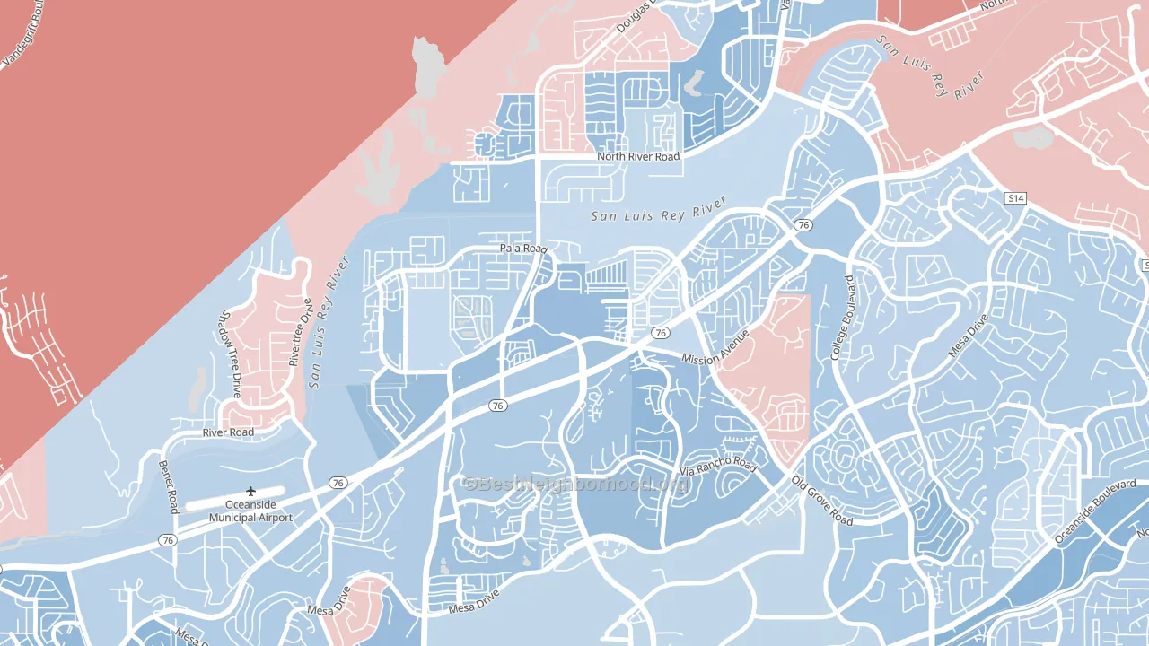
San Luis Rey leans slightly Democratic by roughly 12 points: about 56% of voters vote Democratic and 44% Republican.
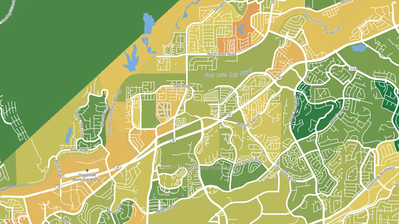
About 55% of adults in San Luis Rey typically vote, below the U.S. average of about 62%. Among adults in San Luis Rey, ~31% vote Democratic, ~24% Republican, and ~45% don't vote. The map below shows estimated turnout by block group.
How San Luis Rey compares
Among neighborhoods within 5 miles, San Luis Rey leans more Democratic than 4 of 9 neighbors.
San Luis Rey runs about 9 points more Republican than California as a whole.
Politics vary noticeably by block within San Luis Rey. The southwest side is the most Democratic-leaning (D+18) and the northwest side is the least Democratic-leaning (D+6), a spread of about 12 points.
Why San Luis Rey leans the way it does
Density, race composition, education, and family structure all sit close to their national averages in San Luis Rey. The lean here lands roughly where demographic data alone would predict.
Paved land cover and Democratic lean
Places with extensive paved surfaces tend to lean Democratic; San Luis Rey, Oceanside, CA sits above the national average on this measure. Paved ground does not change how people vote; it mostly reflects how urban and built-up a place is.
Why turnout in San Luis Rey looks the way it does
Crowded housing lines up with lower turnout. About 6% of homes in San Luis Rey have more than one occupant per room, above 81% of neighborhoods. Learn more about the findings and methodology on the political spectrum map.
Nearby Neighborhoods
- Ivey Ranch-Rancho del Oro, Oceanside, CA D+13
- North Valley San Diego, Oceanside, CA D+10
- Guajome, Oceanside, CA Even
- Peacock, Oceanside, CA D+10
- Fire Mountain, Oceanside, CA D+19
- East Side Capistrano, Oceanside, CA D+15
- Lake, Oceanside, CA D+3
- Townsite, Oceanside, CA D+31
- South Oceanside, Oceanside, CA D+19
- Downtown Carlsbad, Carlsbad, CA D+24
Neighborhoods with Similar Populations
- Manoa, Honolulu, HI D+44
- Noe Valley, San Francisco, CA D+82
- Mililani Mauka-Launani Valley, Mililani, HI D+16
- Central Arlington, Arlington, TX D+25
- Rosedale, Bakersfield, CA R+53
- Nob Hill, San Francisco, CA D+62
- Flour Bluff, Corpus Christi, TX R+31
- Mountain View, El Monte, CA D+28
- West Baltimore, Baltimore, MD D+82
- Kalihi Valley, Honolulu, HI D+11
Sources and methodology
Precinct-level voting records used to fit the model come from California Secretary of State, Elections, distributed by the Voting and Election Science Team. Demographic inputs come from the U.S. Census Bureau (ACS 5-year estimates and the 2020 Decennial Census). Health and environmental inputs come from the CDC (PLACES and the Environmental Justice Index). Land cover comes from the USGS and EPA. Election-day and lead-up weather come from PRISM 4km daily grids and the NOAA Global Historical Climatology Network. Mail-voting and election-administration patterns come from the MIT Election Lab's Survey of the Performance of American Elections. Block-group crime detail comes from CrimeGrade. Internet data and modeling support provided by ISPreports.org.
Modeling and analysis by the BestNeighborhood data science team. Full methodology and findings: political spectrum map.
Methodology reviewed by the BestNeighborhood data team. Last updated May 2026.