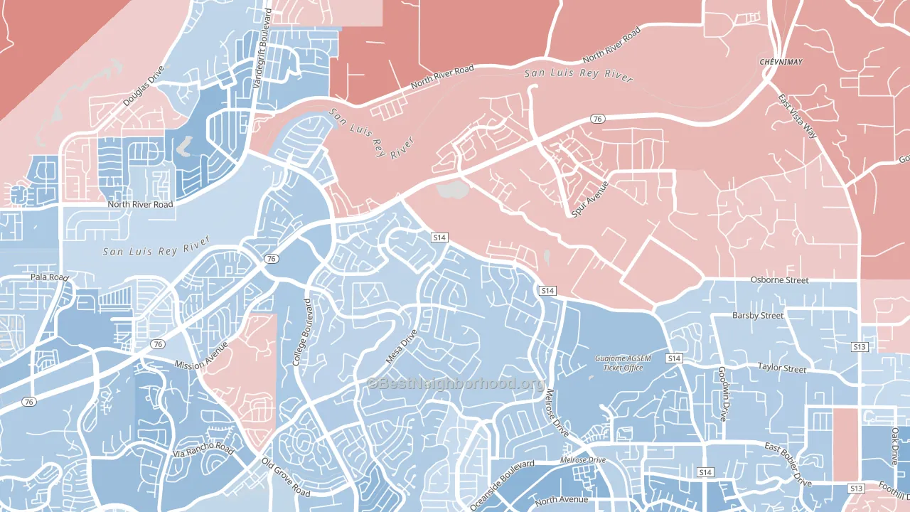
Guajome is a true toss-up. About 51% of voters here vote Democratic and 49% Republican.
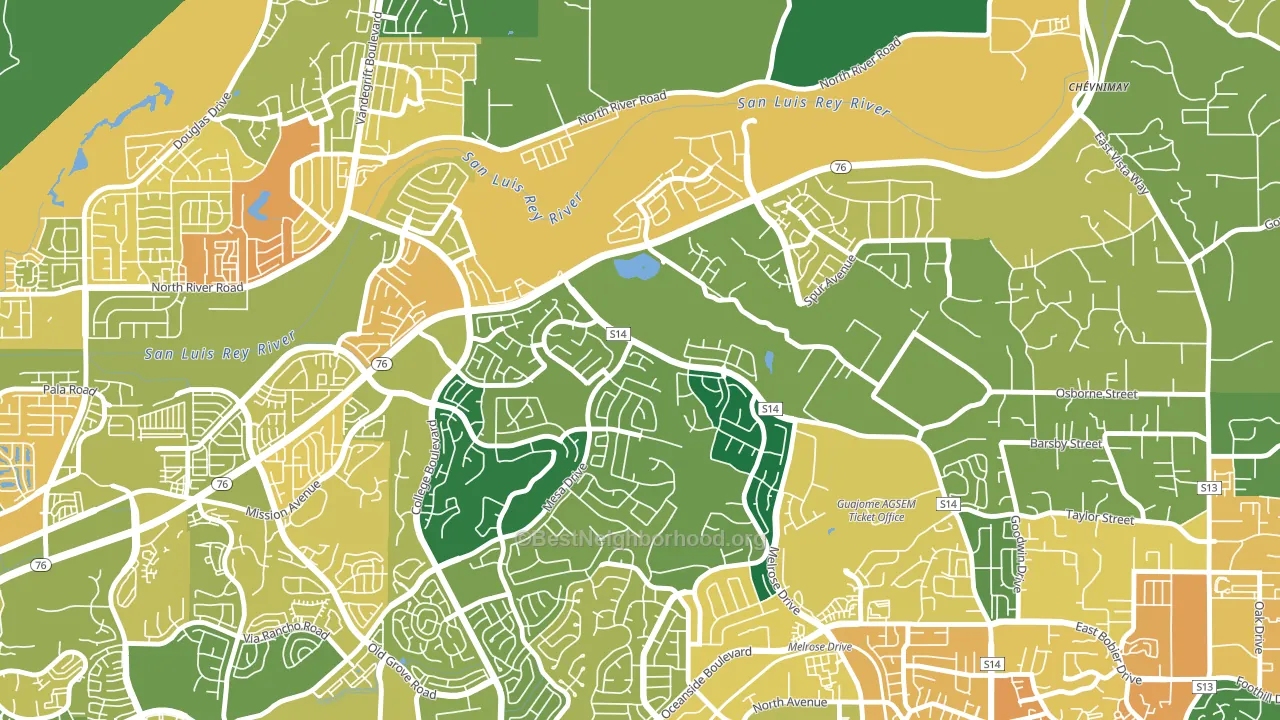
About 76% of adults in Guajome typically vote, above the U.S. average of about 62%. Among adults in Guajome, ~39% vote Democratic, ~37% Republican, and ~24% don't vote. The map below shows estimated turnout by block group.
How Guajome compares
Among neighborhoods within 5 miles, Guajome sits roughly in the middle of the political spectrum, with 0 neighbors leaning further in the place's direction and 5 leaning the other way.
Guajome runs about 18 points more Republican than California as a whole.
Politics vary noticeably by block within Guajome. The south side runs the most Democratic (D+12) and the northeast side runs the most Republican (R+9), a spread of about 22 points.
Why Guajome leans the way it does
Density, race composition, education, and family structure all sit close to their national averages in Guajome. The lean here lands roughly where demographic data alone would predict.
Preventive-care access and voter turnout
Places with strong routine preventive-care access tend to turn out at a higher rate; Guajome, Oceanside, CA sits above the national average on this measure. Dental visits do not drive turnout; the rate reflects income, insurance, and healthcare access, which line up with who votes.
Why turnout in Guajome looks the way it does
Turnout in Guajome sits close to the national pattern. Routine healthcare access, homeownership, education, and food security all land near their national averages here. Learn more about the findings and methodology on the political spectrum map.
Nearby Neighborhoods
- Peacock, Oceanside, CA D+10
- North Valley San Diego, Oceanside, CA D+10
- San Luis Rey, Oceanside, CA D+11
- Ivey Ranch-Rancho del Oro, Oceanside, CA D+13
- Lake, Oceanside, CA D+3
- Fire Mountain, Oceanside, CA D+19
- East Side Capistrano, Oceanside, CA D+15
- South Oceanside, Oceanside, CA D+19
- Townsite, Oceanside, CA D+31
- Downtown Carlsbad, Carlsbad, CA D+24
Neighborhoods with Similar Populations
- Sunnyside, Denver, CO D+66
- Fairway Park, Hayward, CA D+36
- oakwood, Dayton, OH D+33
- Temple Crest, Tampa, FL D+48
- North Tampa, Tampa, FL D+38
- Talmadge, San Diego, CA D+48
- Greenhaven, Sacramento, CA D+40
- East San Gabriel, San Gabriel, CA D+20
- Franklin To The Fort, Missoula, MT D+29
- Liberty Area, Lexington, KY D+18
Sources and methodology
Precinct-level voting records used to fit the model come from California Secretary of State, Elections, distributed by the Voting and Election Science Team. Demographic inputs come from the U.S. Census Bureau (ACS 5-year estimates and the 2020 Decennial Census). Health and environmental inputs come from the CDC (PLACES and the Environmental Justice Index). Land cover comes from the USGS and EPA. Election-day and lead-up weather come from PRISM 4km daily grids and the NOAA Global Historical Climatology Network. Mail-voting and election-administration patterns come from the MIT Election Lab's Survey of the Performance of American Elections. Block-group crime detail comes from CrimeGrade. Internet data and modeling support provided by ISPreports.org.
Modeling and analysis by the BestNeighborhood data science team. Full methodology and findings: political spectrum map.
Methodology reviewed by the BestNeighborhood data team. Last updated May 2026.