Printers Row is a Democratic stronghold. About 85% of voters here vote Democratic and 15% Republican.
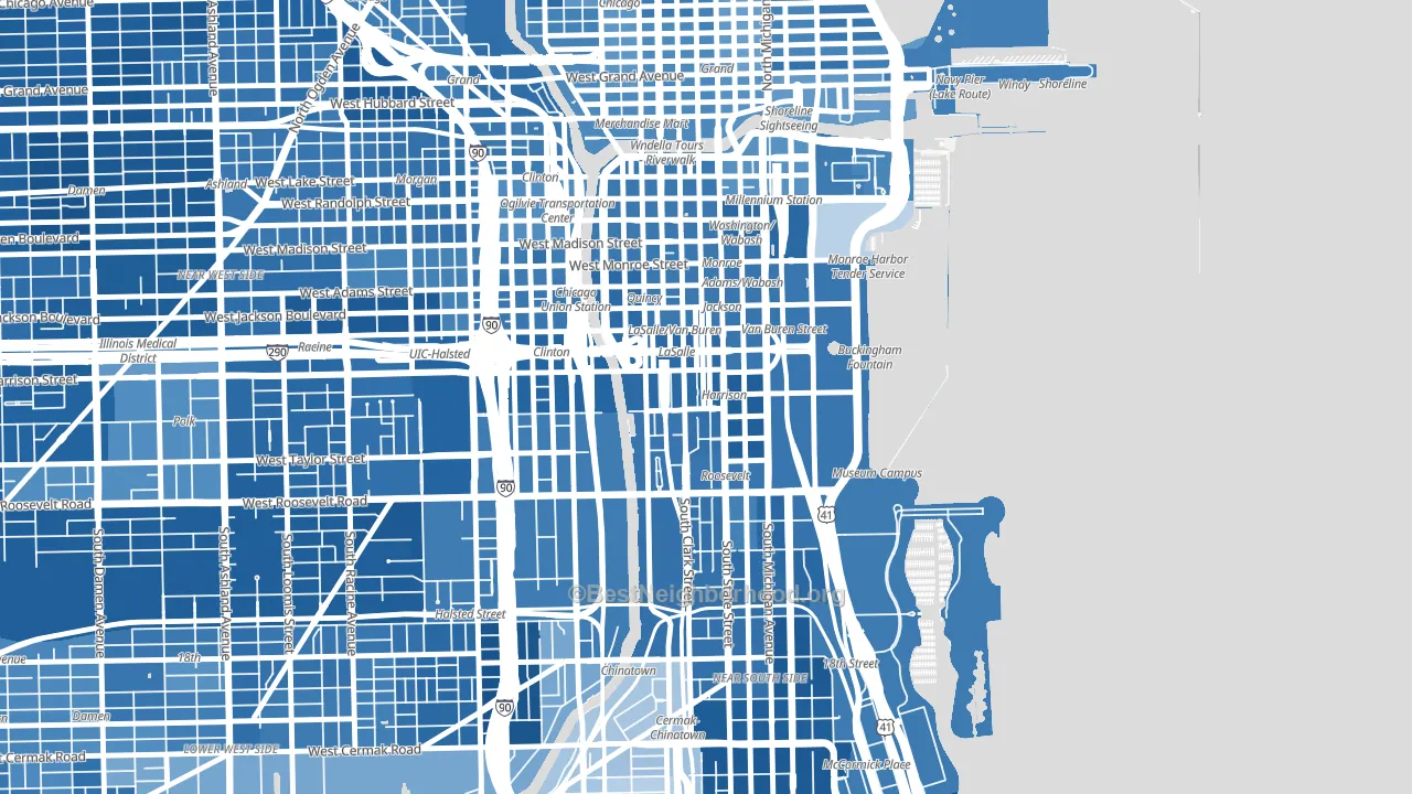
About 47% of adults in Printers Row typically vote, below the U.S. average of about 62%. Among adults in Printers Row, ~40% vote Democratic, ~7% Republican, and ~53% don't vote. The map below shows estimated turnout by block group.
How Printers Row compares
Among neighborhoods within 5 miles, Printers Row leans more Democratic than 20 of 32 neighbors.
Printers Row runs about 59 points more Democratic than Illinois as a whole.
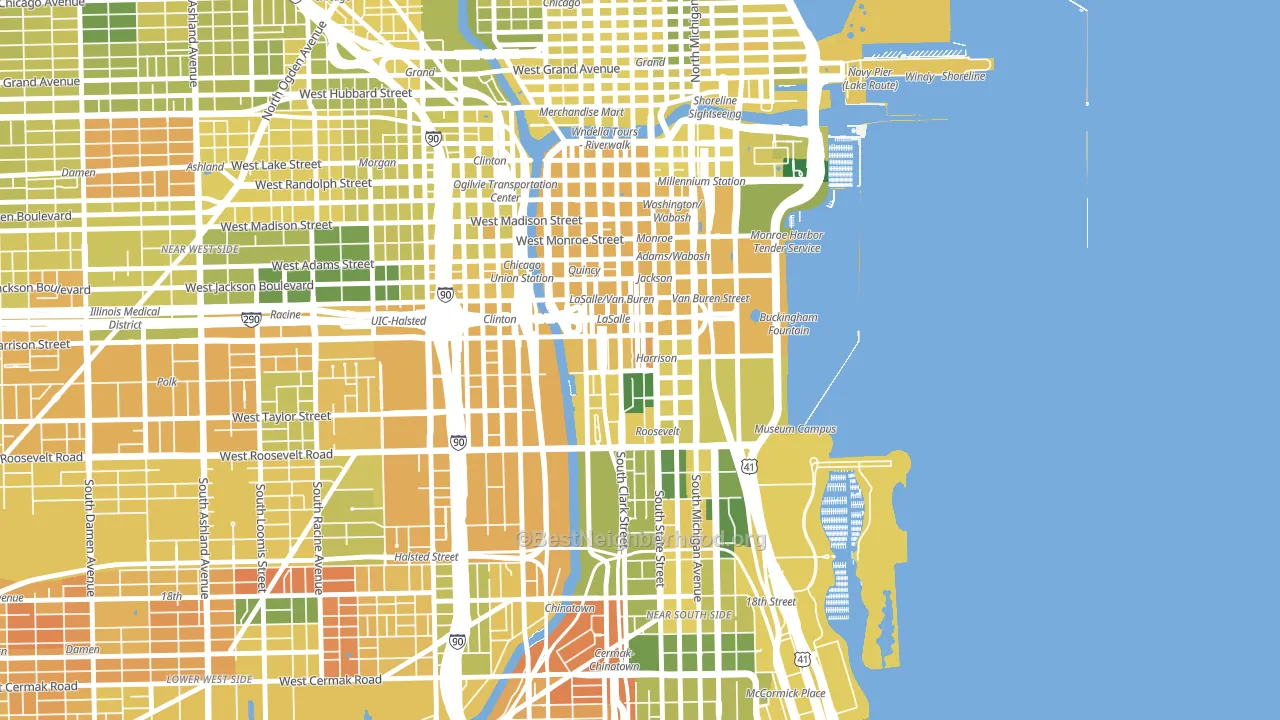
Politics vary noticeably by block within Printers Row. The southeast side is the most Democratic-leaning (D+73) and the west side is the least Democratic-leaning (D+62), a spread of about 11 points.
Why Printers Row leans the way it does
This analysis examined 14,881 data points per neighborhood to find what predicts political lean and turnout. The items below are a few correlations that stood out for Printers Row, not a ranked or complete list of what matters most.
Areas with high college attainment vote Democratic. About 84% of adults in Printers Row hold a bachelor's degree, about 56 points above the U.S. average of 28%. A high never-married share predicts Democratic voting, and about 61% of adults in Printers Row have never been married, above 93% of neighborhoods.
Population density and Democratic lean
Places with high population density tend to lean Democratic; Printers Row, Chicago, IL sits in the top tenth nationally on this measure.
Why turnout in Printers Row looks the way it does
Turnout in Printers Row sits close to the national pattern. Routine healthcare access, homeownership, education, and food security all land near their national averages here. Learn more about the findings and methodology on the political spectrum map.
Nearby Neighborhoods
- Loop, Chicago, IL D+57
- Near South Side, Chicago, IL D+70
- Greektown, Chicago, IL D+59
- University Village, Chicago, IL D+67
- Near North Side, Chicago, IL D+53
- Near West Side, Chicago, IL D+68
- Pilsen, Chicago, IL D+62
- Armour Square, Chicago, IL D+16
- Gold Coast, Chicago, IL D+54
- Lower West Side, Chicago, IL D+58
Neighborhoods with Similar Populations
- East Tampa, Tampa, FL D+66
- Summerdale, Philadelphia, PA D+58
- Southwestern Outer Drive, Dearborn, MI D+3
- Burns Park, Ann Arbor, MI D+69
- North Redlands, Redlands, CA D+6
- Loop, Chicago, IL D+57
- Santa Clara, Eugene, OR D+19
- West Las Vegas, Las Vegas, NV D+52
- East Bloomington, Bloomington, MN D+36
- Rockdale, Atlanta, GA D+58
Sources and methodology
Precinct-level voting records used to fit the model come from Illinois State Board of Elections, distributed by the Voting and Election Science Team. Demographic inputs come from the U.S. Census Bureau (ACS 5-year estimates and the 2020 Decennial Census). Health and environmental inputs come from the CDC (PLACES and the Environmental Justice Index). Land cover comes from the USGS and EPA. Election-day and lead-up weather come from PRISM 4km daily grids and the NOAA Global Historical Climatology Network. Mail-voting and election-administration patterns come from the MIT Election Lab's Survey of the Performance of American Elections. Block-group crime detail comes from CrimeGrade. Internet data and modeling support provided by ISPreports.org.
Modeling and analysis by the BestNeighborhood data science team. Full methodology and findings: political spectrum map.
Methodology reviewed by the BestNeighborhood data team. Last updated May 2026.