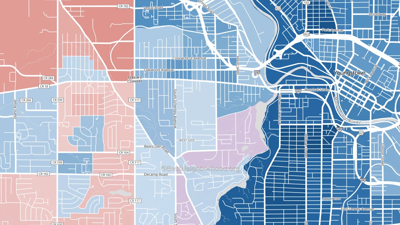
Schenley leans slightly Democratic by roughly 10 points: about 55% of voters vote Democratic and 45% Republican.
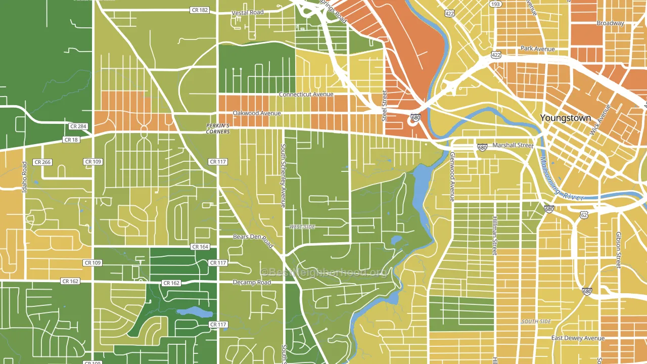
About 68% of adults in Schenley typically vote, above the U.S. average of about 62%. Among adults in Schenley, ~37% vote Democratic, ~30% Republican, and ~33% don't vote. The map below shows estimated turnout by block group.
How Schenley compares
Among neighborhoods within 5 miles, Schenley leans more Democratic than 1 of 6 neighbors.
Schenley runs about 22 points more Democratic than Ohio as a whole. Ohio leans Republican overall, while Schenley is one of the few Democratic-leaning pockets.
Politics vary noticeably by block within Schenley. The southeast side is the most Democratic-leaning (D+35) and the southwest side is the least Democratic-leaning (Even), a spread of about 34 points.
Why Schenley leans the way it does
This analysis examined 14,881 data points per neighborhood to find what predicts political lean and turnout. The items below are a few correlations that stood out for Schenley, not a ranked or complete list of what matters most.
Schenley votes against the grain of Ohio. Ohio leans Republican overall, while Schenley runs about 22 points more Democratic.
Preventive-care access and voter turnout
Places with limited routine preventive-care access tend to turn out at a lower rate; Schenley, Youngstown, OH sits below the national average on this measure. Dental visits do not drive turnout; the rate reflects income, insurance, and healthcare access, which line up with who votes.
Why turnout in Schenley looks the way it does
Turnout in Schenley sits close to the national pattern. Learn more about the findings and methodology on the political spectrum map.
Nearby Neighborhoods
- Arlington, Youngstown, OH D+44
- Belle Vista, Youngstown, OH D+21
- Kirkmere, Youngstown, OH D+7
- North Heights, Youngstown, OH D+57
- Lansingville, Youngstown, OH D+40
- Landsdowne, Youngstown, OH D+66
- North Hill Historic District, New Castle, PA R+5
- Downtown Kent, Kent, OH D+29
- The Boulevards, Canton, OH D+21
- Colonial Heights, Canton, OH D+6
Neighborhoods with Similar Populations
- Ednor Gardens-Lakeside, Baltimore, MD D+86
- Harris, Lehigh Acres, FL R+8
- Southwood, Old Bridge, NJ R+22
- North Park, Billings, MT D+17
- Maple Heights-Lake Desire, Renton, WA D+17
- Tierra Oeste, Albuquerque, NM D+15
- Midtown Springfield, Springfield, MO D+17
- Greenwood and Hamilton, Trenton, NJ D+64
- Rosemont, Portland, ME D+69
- Questa, Mountain House, CA D+10
Sources and methodology
Precinct-level voting records used to fit the model come from Ohio Secretary of State, Elections, distributed by the Voting and Election Science Team. Demographic inputs come from the U.S. Census Bureau (ACS 5-year estimates and the 2020 Decennial Census). Health and environmental inputs come from the CDC (PLACES and the Environmental Justice Index). Land cover comes from the USGS and EPA. Election-day and lead-up weather come from PRISM 4km daily grids and the NOAA Global Historical Climatology Network. Mail-voting and election-administration patterns come from the MIT Election Lab's Survey of the Performance of American Elections. Block-group crime detail comes from CrimeGrade. Internet data and modeling support provided by ISPreports.org.
Modeling and analysis by the BestNeighborhood data science team. Full methodology and findings: political spectrum map.
Methodology reviewed by the BestNeighborhood data team. Last updated May 2026.