Slater Park is a Democratic stronghold. About 88% of voters here vote Democratic and 12% Republican.
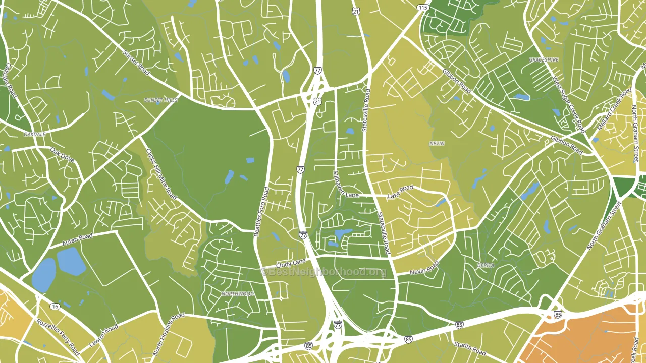
About 74% of adults in Slater Park typically vote, above the U.S. average of about 62%. Among adults in Slater Park, ~65% vote Democratic, ~9% Republican, and ~26% don't vote. The map below shows estimated turnout by block group.
How Slater Park compares
Among neighborhoods within 5 miles, Slater Park leans more Democratic than 18 of 20 neighbors.
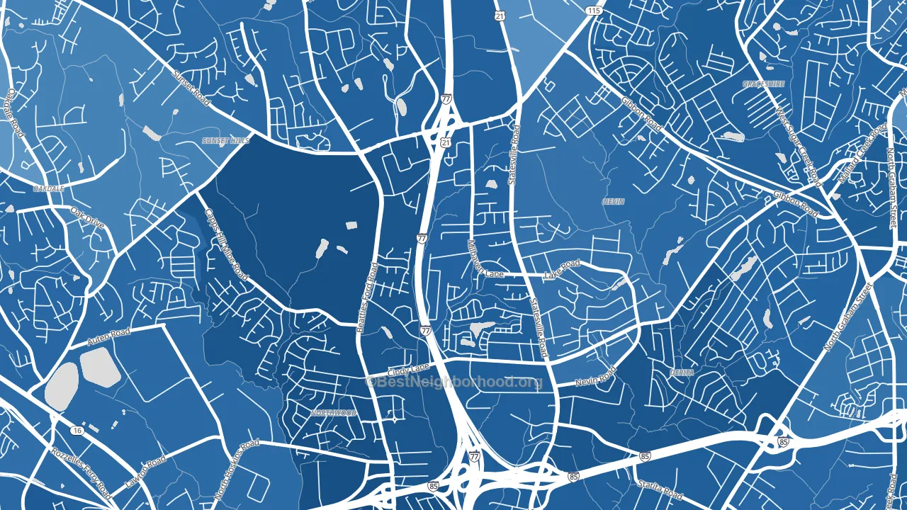
Slater Park runs about 80 points more Democratic than North Carolina as a whole. North Carolina leans Republican overall, while Slater Park is one of the few Democratic-leaning pockets.
Why Slater Park leans the way it does
This analysis examined 14,881 data points per neighborhood to find what predicts political lean and turnout. The items below are a few correlations that stood out for Slater Park, not a ranked or complete list of what matters most.
Slater Park votes against the grain of North Carolina. North Carolina leans Republican overall, while Slater Park runs about 80 points more Democratic. A high never-married share predicts Democratic voting, and about 48% of adults in Slater Park have never been married, above 78% of neighborhoods.
Population density and Republican lean
Places with low population density tend to lean Republican; Slater Park, Charlotte, NC sits below the national average on this measure.
Why turnout in Slater Park looks the way it does
Turnout in Slater Park sits close to the national pattern. Routine healthcare access, homeownership, education, and food security all land near their national averages here. Learn more about the findings and methodology on the political spectrum map.
Nearby Neighborhoods
- Nevin Community, Charlotte, NC D+67
- Firestone-Garden Park, Charlotte, NC D+78
- Beatties Ford-Trinity, Charlotte, NC D+75
- Derita-Statesville, Charlotte, NC D+75
- Rockwell Park-Hemphill Heights, Charlotte, NC D+72
- West Sugar Creek, Charlotte, NC D+71
- Wedgewood, Charlotte, NC D+66
- Oakdale South, Charlotte, NC D+60
- Thomasboro-Hoskins, Charlotte, NC D+75
- Sugaw Creek, Charlotte, NC D+65
Neighborhoods with Similar Populations
- East Somerville, Somerville, MA D+59
- Miller Creek, Missoula, MT D+3
- Brookside Glen, Chicago, IL D+47
- Avalon Park Village, Alafaya, FL Even
- Castlewood Park, Lexington, KY D+16
- Westcott, Syracuse, NY D+68
- Hartley, Lincoln, NE D+36
- Ventura, Orlando, FL D+11
- Jacobsville, Evansville, IN Even
- Timber Ridge, San Antonio, TX D+15
Sources and methodology
Precinct-level voting records used to fit the model come from North Carolina State Board of Elections, distributed by the Voting and Election Science Team. Demographic inputs come from the U.S. Census Bureau (ACS 5-year estimates and the 2020 Decennial Census). Health and environmental inputs come from the CDC (PLACES and the Environmental Justice Index). Land cover comes from the USGS and EPA. Election-day and lead-up weather come from PRISM 4km daily grids and the NOAA Global Historical Climatology Network. Mail-voting and election-administration patterns come from the MIT Election Lab's Survey of the Performance of American Elections. Block-group crime detail comes from CrimeGrade. Internet data and modeling support provided by ISPreports.org.
Modeling and analysis by the BestNeighborhood data science team. Full methodology and findings: political spectrum map.
Methodology reviewed by the BestNeighborhood data team. Last updated May 2026.