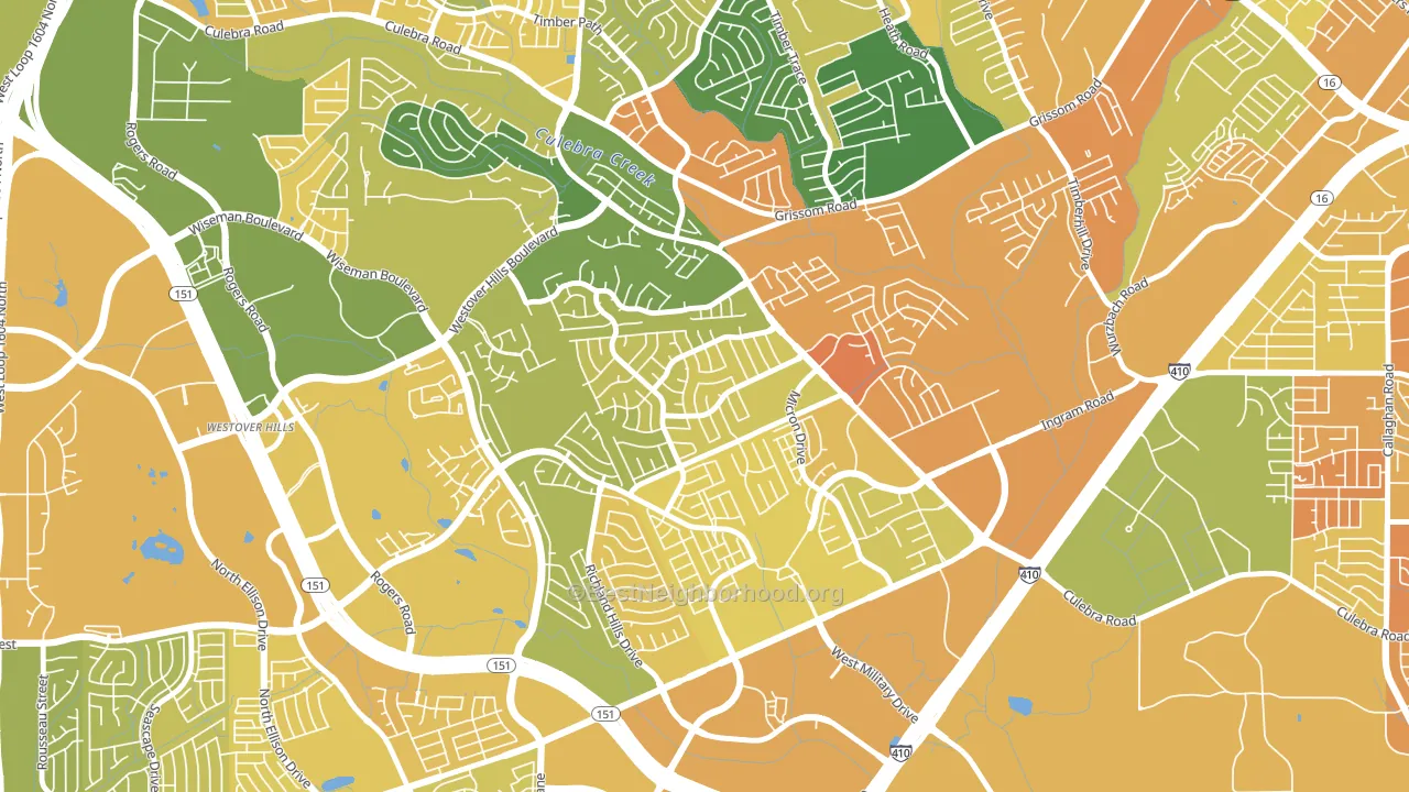
Timber Ridge leans slightly Democratic by roughly 14 points: about 57% of voters vote Democratic and 43% Republican.
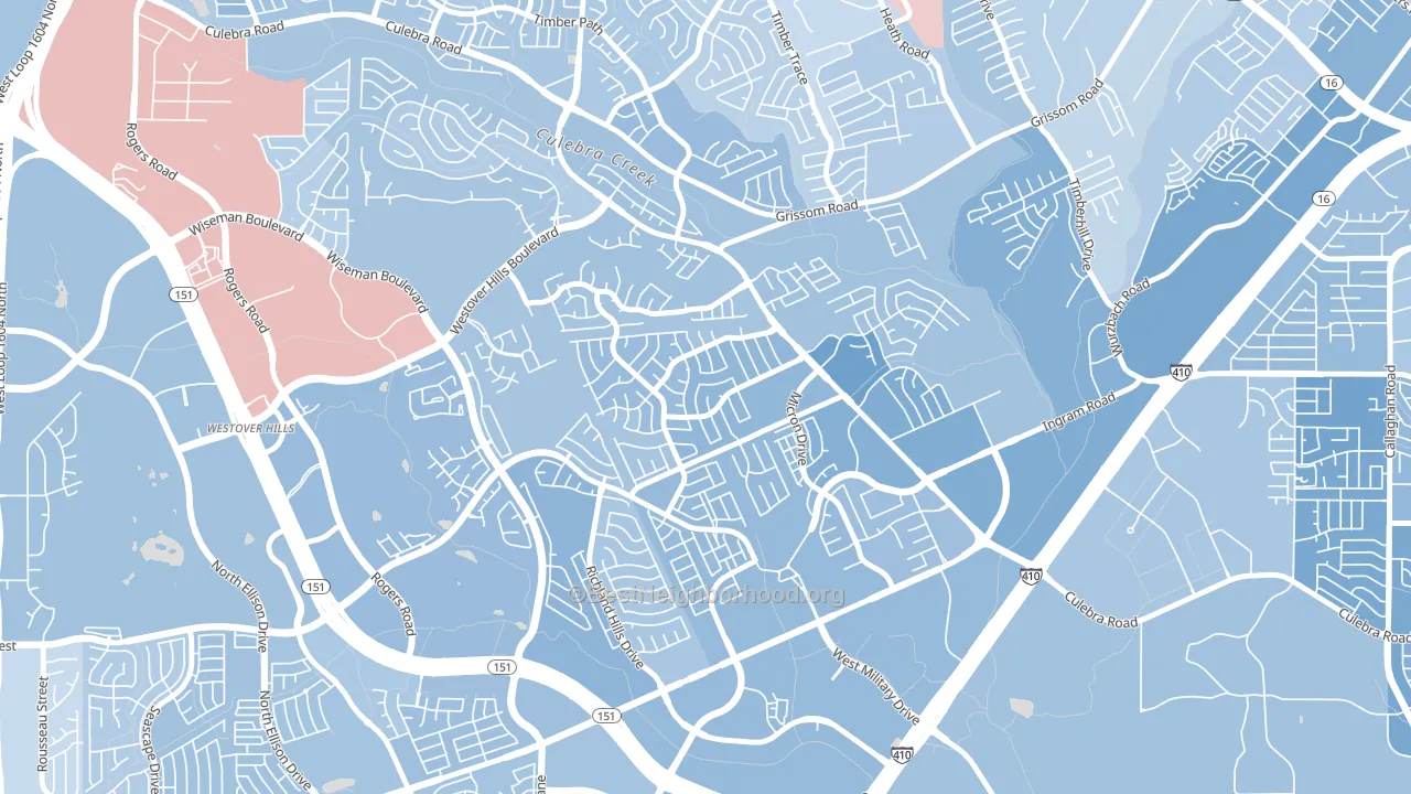
About 54% of adults in Timber Ridge typically vote, below the U.S. average of about 62%. Among adults in Timber Ridge, ~31% vote Democratic, ~23% Republican, and ~46% don't vote. The map below shows estimated turnout by block group.
How Timber Ridge compares
Among neighborhoods within 5 miles, Timber Ridge leans more Democratic than 6 of 21 neighbors.
Timber Ridge runs about 28 points more Democratic than Texas as a whole. Texas leans Republican overall, while Timber Ridge is one of the few Democratic-leaning pockets.
Why Timber Ridge leans the way it does
This analysis examined 14,881 data points per neighborhood to find what predicts political lean and turnout. The items below are a few correlations that stood out for Timber Ridge, not a ranked or complete list of what matters most.
Timber Ridge votes against the grain of Texas. Texas leans Republican overall, while Timber Ridge runs about 28 points more Democratic. Density combined with diversity predicts Democratic voting, and non-Hispanic white share in Timber Ridge is about 20%, about 53 points below the U.S. average of 72%.
Paved land cover and Democratic lean
Places with extensive paved surfaces tend to lean Democratic; Timber Ridge, San Antonio, TX sits in the top quarter nationally on this measure. Paved ground does not change how people vote; it mostly reflects how urban and built-up a place is.
Why turnout in Timber Ridge looks the way it does
Areas with limited routine healthcare access turn out at lower rates. Timber Ridge is in the bottom quarter nationally for routine-care measures such as insurance coverage, preventive screenings, and dental visits. The dental-visit rate here is about 50%, about 10 points below the U.S. average of 60%. Learn more about the findings and methodology on the political spectrum map.
Nearby Neighborhoods
- Crown Meadows, San Antonio, TX D+22
- Pipers Meadow, San Antonio, TX D+21
- San Antonio Creekside, San Antonio, TX D+11
- Great Northwest, San Antonio, TX D+10
- Heritage, San Antonio, TX D+20
- Sierra Springs, San Antonio, TX D+12
- Meadow Village, San Antonio, TX D+24
- Thunderbird Hills, San Antonio, TX D+23
- Northwest Crossing, San Antonio, TX D+13
- United Westwood, San Antonio, TX D+28
Neighborhoods with Similar Populations
- Bayou Oaks, Sarasota, FL D+17
- East Bluff, Peoria, IL D+57
- Ventura, Orlando, FL D+11
- Riverside, Tempe, AZ D+42
- Hartley, Lincoln, NE D+36
- South University, Eugene, OR D+74
- Castlewood Park, Lexington, KY D+16
- Avalon Park Village, Alafaya, FL Even
- North End, Nashua, NH D+20
- Miller Creek, Missoula, MT D+3
Sources and methodology
Precinct-level voting records used to fit the model come from Texas Secretary of State, Elections Division, distributed by the Voting and Election Science Team. Demographic inputs come from the U.S. Census Bureau (ACS 5-year estimates and the 2020 Decennial Census). Health and environmental inputs come from the CDC (PLACES and the Environmental Justice Index). Land cover comes from the USGS and EPA. Election-day and lead-up weather come from PRISM 4km daily grids and the NOAA Global Historical Climatology Network. Mail-voting and election-administration patterns come from the MIT Election Lab's Survey of the Performance of American Elections. Block-group crime detail comes from CrimeGrade. Internet data and modeling support provided by ISPreports.org.
Modeling and analysis by the BestNeighborhood data science team. Full methodology and findings: political spectrum map.
Methodology reviewed by the BestNeighborhood data team. Last updated May 2026.