South University is a Democratic stronghold. About 87% of voters here vote Democratic and 13% Republican.
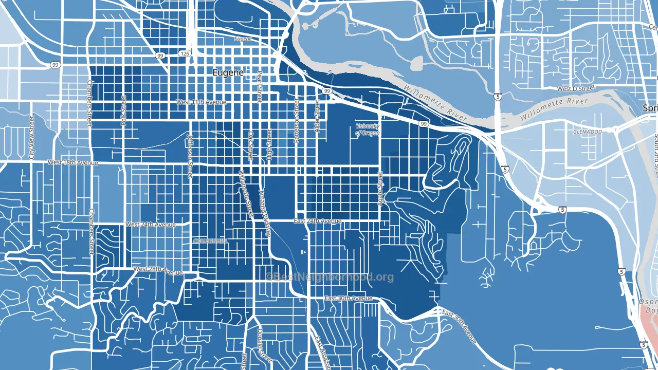
About 46% of adults in South University typically vote, below the U.S. average of about 62%. Among adults in South University, ~40% vote Democratic, ~6% Republican, and ~54% don't vote. The map below shows estimated turnout by block group.
How South University compares
Among neighborhoods within 5 miles, South University leans more Democratic than 13 of 14 neighbors.
South University runs about 60 points more Democratic than Oregon as a whole.
Why South University leans the way it does
This analysis examined 14,881 data points per neighborhood to find what predicts political lean and turnout. The items below are a few correlations that stood out for South University, not a ranked or complete list of what matters most.
Areas with high college attainment vote Democratic. About 75% of adults in South University hold a bachelor's degree, about 46 points above the U.S. average of 28%. Dense areas vote Democratic, and South University sits in the top fifth on density (more than 99%, above 89% of neighborhoods). A high never-married share predicts Democratic voting, and about 74% of adults in South University have never been married, above 98% of neighborhoods.
Never-married share, developed land, and voter turnout
Places that combine a never-married-heavy adult population and a heavily developed built environment tend to turn out at a lower rate, as South University, Eugene, OR does.
Why turnout in South University looks the way it does
Renters vote less often than owners. About 84% of households in South University rent, about 59 points above the U.S. average of 25%. High-crime urban areas turn out at lower rates, and South University sits in the top 15% on a violent-crime measure. Learn more about the findings and methodology on the political spectrum map.
Nearby Neighborhoods
- West University, Eugene, OR D+62
- Fairmount, Eugene, OR D+73
- U of O Campus, Eugene, OR D+74
- Friendly, Eugene, OR D+70
- Jefferson Westside, Eugene, OR D+71
- Southeast, Eugene, OR D+63
- Whiteaker, Eugene, OR D+62
- Crest Drive, Eugene, OR D+65
- West Eugene, Eugene, OR D+53
- Harlow, Eugene, OR D+40
Neighborhoods with Similar Populations
Sources and methodology
Precinct-level voting records used to fit the model come from Oregon Secretary of State, Elections Division, distributed by the Voting and Election Science Team. Demographic inputs come from the U.S. Census Bureau (ACS 5-year estimates and the 2020 Decennial Census). Health and environmental inputs come from the CDC (PLACES and the Environmental Justice Index). Land cover comes from the USGS and EPA. Election-day and lead-up weather come from PRISM 4km daily grids and the NOAA Global Historical Climatology Network. Mail-voting and election-administration patterns come from the MIT Election Lab's Survey of the Performance of American Elections. Block-group crime detail comes from CrimeGrade. Internet data and modeling support provided by ISPreports.org.
Modeling and analysis by the BestNeighborhood data science team. Full methodology and findings: political spectrum map.
Methodology reviewed by the BestNeighborhood data team. Last updated May 2026.