North End leans Democratic by roughly 20 points: about 60% of voters vote Democratic and 40% Republican. These figures are model estimates: New Hampshire did not have precinct-level voting records available for training, so the numbers above come from demographic and health features rather than local ground truth.
[sc name="abovemapcta"]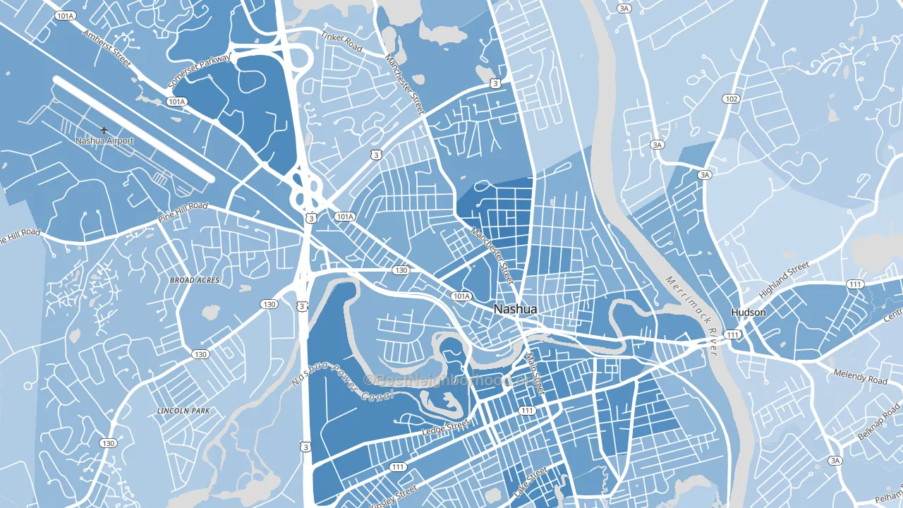 [bestneighborhood_map_controls]
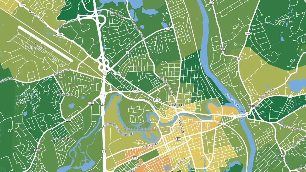
About 76% of adults in North End typically vote, above the U.S. average of about 62%. Among adults in North End, ~46% vote Democratic, ~31% Republican, and ~23% don't vote. The map below shows estimated turnout by block group.
 [bestneighborhood_map_controls]
How North End compares
Among neighborhoods within 5 miles, North End leans more Democratic than 2 of 6 neighbors.
North End runs about 17 points more Democratic than New Hampshire as a whole.
Politics vary noticeably by block within North End. The southwest side is the most Democratic-leaning (D+26) and the north side is the least Democratic-leaning (D+11), a spread of about 15 points.
Why North End leans the way it does
Density, race composition, education, and family structure all sit close to their national averages in North End. None of them point strongly toward either party.
Cancer-screening access and voter turnout
Places with high colon-cancer-screening access tend to turn out at a higher rate; North End, Nashua, NH sits in the top quarter nationally on this measure. Cancer screening does not drive turnout; it reflects income, insurance, and healthcare access.
Why turnout in North End looks the way it does
Turnout in North End sits close to the national pattern. Routine healthcare access, homeownership, education, and food security all land near their national averages here. Learn more about the findings and methodology on the political spectrum map.
[one_half]Nearby Neighborhoods
- Nashua Historic District, Nashua, NH D+24
- Mine Falls Park, Nashua, NH D+17
- Downtown Nashua, Nashua, NH D+31
- Northwest Nashua, Nashua, NH D+23
- Southeast Nashua, Nashua, NH D+26
- South End, Nashua, NH D+16
- Pawtucketville, Lowell, MA D+15
- The Acre, Lowell, MA D+42
- Centralville, Lowell, MA D+20
- Highlands, Lowell, MA D+28
Neighborhoods with Similar Populations
- Alondra Park, Lawndale, CA D+29
- Overton, Mobile, AL R+8
- Riverside, Tempe, AZ D+42
- South University, Eugene, OR D+74
- Cedar Hills Estates, Jacksonville, FL D+10
- East Bluff, Peoria, IL D+57
- Bayou Oaks, Sarasota, FL D+17
- Timber Ridge, San Antonio, TX D+15
- Ventura, Orlando, FL D+11
- Hartley, Lincoln, NE D+36
Sources and methodology
Precinct-level voting records used to fit the model come from New Hampshire Secretary of State, Elections Division, distributed by the Voting and Election Science Team. Demographic inputs come from the U.S. Census Bureau (ACS 5-year estimates and the 2020 Decennial Census). Health and environmental inputs come from the CDC (PLACES and the Environmental Justice Index). Land cover comes from the USGS and EPA. Election-day and lead-up weather come from PRISM 4km daily grids and the NOAA Global Historical Climatology Network. Mail-voting and election-administration patterns come from the MIT Election Lab's Survey of the Performance of American Elections. Block-group crime detail comes from CrimeGrade. Internet data and modeling support provided by ISPreports.org.
Modeling and analysis by the BestNeighborhood data science team. NH did not have precinct-level voting records available for training, so the figures here come from extrapolation across demographic, health, and land-use features rather than local ground truth. Full methodology and findings: political spectrum map.
Methodology reviewed by the BestNeighborhood data team. Last updated May 2026.