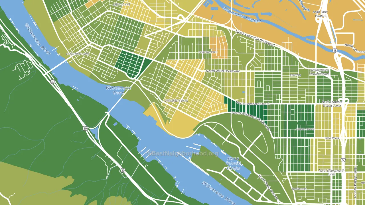
University Park is a Democratic stronghold. About 82% of voters here vote Democratic and 18% Republican.
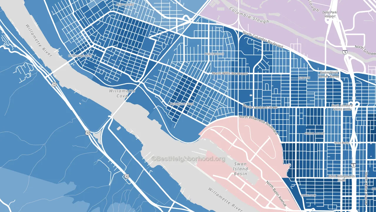
About 57% of adults in University Park typically vote, near the U.S. average of about 62%. Among adults in University Park, ~46% vote Democratic, ~10% Republican, and ~44% don't vote. The map below shows estimated turnout by block group.
How University Park compares
Among neighborhoods within 5 miles, University Park leans more Democratic than 9 of 22 neighbors.
University Park runs about 49 points more Democratic than Oregon as a whole.
Why University Park leans the way it does
This analysis examined 14,881 data points per neighborhood to find what predicts political lean and turnout. The items below are a few correlations that stood out for University Park, not a ranked or complete list of what matters most.
Areas with many never-married adults vote Democratic. About 64% of adults in University Park have never been married, modestly above similar-sized neighborhoods (around 54%).
Population density and Democratic lean
Places with high population density tend to lean Democratic; University Park, Portland, OR sits in the top quarter nationally on this measure.
Why turnout in University Park looks the way it does
Turnout in University Park sits close to the national pattern. Routine healthcare access, homeownership, education, and food security all land near their national averages here. Learn more about the findings and methodology on the political spectrum map.
Nearby Neighborhoods
- Portsmouth, Portland, OR D+61
- Cathedral Park, Portland, OR D+66
- Kenton, Portland, OR D+74
- St. Johns, Portland, OR D+48
- Arbor Lodge, Portland, OR D+75
- Overlook, Portland, OR D+83
- Boise, Portland, OR D+81
- Woodlawn, Portland, OR D+78
- Forest Park, Portland, OR D+52
- Slabtown, Portland, OR D+78
Neighborhoods with Similar Populations
- Plaza-Eastway, Charlotte, NC D+74
- Nashboro Village, Nashville, TN D+39
- North Hill Historic District, New Castle, PA R+5
- Agua Fria, El Mirage, AZ D+12
- West University, Tucson, AZ D+58
- Royal Poinciana, Hollywood, FL D+20
- Downtown Normal, Normal, IL D+48
- Arrowhead, San Bernardino, CA D+10
- Lindenville, South San Francisco, CA D+40
- Lakeland, Baltimore, MD D+56
Sources and methodology
Precinct-level voting records used to fit the model come from Oregon Secretary of State, Elections Division, distributed by the Voting and Election Science Team. Demographic inputs come from the U.S. Census Bureau (ACS 5-year estimates and the 2020 Decennial Census). Health and environmental inputs come from the CDC (PLACES and the Environmental Justice Index). Land cover comes from the USGS and EPA. Election-day and lead-up weather come from PRISM 4km daily grids and the NOAA Global Historical Climatology Network. Mail-voting and election-administration patterns come from the MIT Election Lab's Survey of the Performance of American Elections. Block-group crime detail comes from CrimeGrade. Internet data and modeling support provided by ISPreports.org.
Modeling and analysis by the BestNeighborhood data science team. Full methodology and findings: political spectrum map.
Methodology reviewed by the BestNeighborhood data team. Last updated May 2026.