Heron Bay leans heavily Democratic by roughly 32 points: about 66% of voters vote Democratic and 34% Republican.
[sc name="abovemapcta"]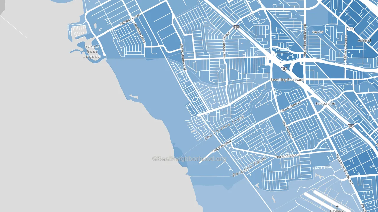 [bestneighborhood_map_controls]
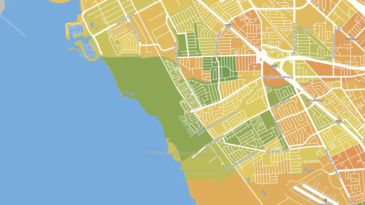
About 71% of adults in Heron Bay typically vote, above the U.S. average of about 62%. Among adults in Heron Bay, ~47% vote Democratic, ~24% Republican, and ~29% don't vote. The map below shows estimated turnout by block group.
 [bestneighborhood_map_controls]
How Heron Bay compares
Among neighborhoods within 5 miles, Heron Bay leans more Democratic than 3 of 25 neighbors.
Heron Bay runs about 12 points more Democratic than California as a whole.
Why Heron Bay leans the way it does
Density, race composition, education, and family structure all sit close to their national averages in Heron Bay. The lean here lands roughly where demographic data alone would predict.
Preventive-care access and voter turnout
Places with strong routine preventive-care access tend to turn out at a higher rate; Heron Bay, San Leandro, CA sits in the top quarter nationally on this measure. Dental visits do not drive turnout; the rate reflects income, insurance, and healthcare access, which line up with who votes.
Why turnout in Heron Bay looks the way it does
Homeowners vote more often than renters. About 89% of households in Heron Bay own their home, about 27 points above the California average of 62%. Learn more about the findings and methodology on the political spectrum map.
[one_half]Nearby Neighborhoods
- Washington Manor-Bonaire, San Leandro, CA D+28
- Floresta Gardens-Bradrick, San Leandro, CA D+41
- Mullford Gardens, San Leandro, CA D+32
- Lower Bal, San Leandro, CA D+39
- Upper Bal, San Leandro, CA D+44
- Davis Tract, San Leandro, CA D+36
- Old San Leandro, San Leandro, CA D+50
- Assumption Parish, San Leandro, CA D+45
- Longwood-Winton Grove, Hayward, CA D+37
- Sobrante Park, Oakland, CA D+52
Neighborhoods with Similar Populations
- Hembstead, Charlotte, NC D+8
- Glenroy Village, Indianapolis, IN R+15
- West Leominster, Leominster, MA D+12
- Carver, Mobile, AL D+87
- Lockmar Estates, Palm Bay, FL R+15
- Poinciana-Village 3, Poinciana, FL D+14
- Edmondson Heights, Woodlawn, MD D+81
- North Growth Area, Fresno, CA R+28
- 4th Ward, Portsmouth, OH R+25
- Factoria, Bellevue, WA D+40
Sources and methodology
Precinct-level voting records used to fit the model come from California Secretary of State, Elections, distributed by the Voting and Election Science Team. Demographic inputs come from the U.S. Census Bureau (ACS 5-year estimates and the 2020 Decennial Census). Health and environmental inputs come from the CDC (PLACES and the Environmental Justice Index). Land cover comes from the USGS and EPA. Election-day and lead-up weather come from PRISM 4km daily grids and the NOAA Global Historical Climatology Network. Mail-voting and election-administration patterns come from the MIT Election Lab's Survey of the Performance of American Elections. Block-group crime detail comes from CrimeGrade. Internet data and modeling support provided by ISPreports.org.
Modeling and analysis by the BestNeighborhood data science team. Full methodology and findings: political spectrum map.
Methodology reviewed by the BestNeighborhood data team. Last updated May 2026.