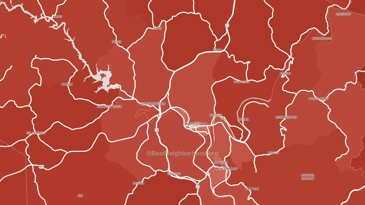
Johnson County is a Republican stronghold. About 17% of voters here vote Democratic and 83% Republican.
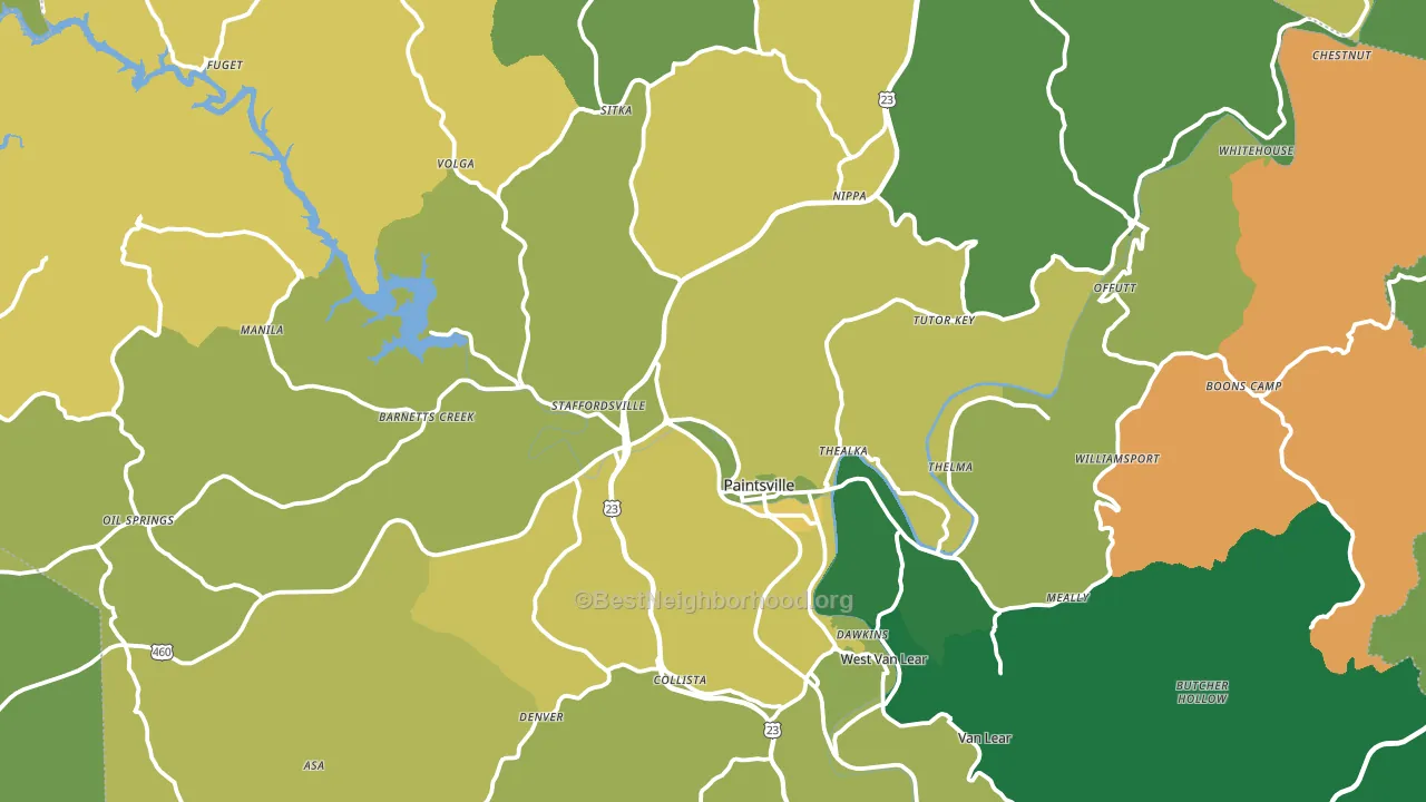
About 66% of adults in Johnson County typically vote, near the U.S. average of about 62%. Among adults in Johnson County, ~11% vote Democratic, ~55% Republican, and ~34% don't vote. The map below shows estimated turnout by block group.
How Johnson County compares
Among counties within 50 miles, Johnson County leans more Republican than 17 of 22 neighbors.
Johnson County runs about 36 points more Republican than Kentucky as a whole.
Why Johnson County leans the way it does
This analysis examined 14,881 data points per county to find what predicts political lean and turnout. The items below are a few correlations that stood out for Johnson County, not a ranked or complete list of what matters most.
Car-dependent areas vote Republican. About 83% of residents in Johnson County drive to work alone, about 10 points above the U.S. average of 74%. A high white share with below-average college attainment predicts Republican voting, and Johnson County fits that profile on both counts. A high family-household share predicts Republican voting, and about 70% of households in Johnson County are family households, above 80% of counties.
Preventive-care access and voter turnout
Places with limited routine preventive-care access tend to turn out at a lower rate; Johnson County, KY sits in the bottom quarter nationally on this measure. Dental visits do not drive turnout; the rate reflects income, insurance, and healthcare access, which line up with who votes.
Why turnout in Johnson County looks the way it does
Turnout in Johnson County sits close to the national pattern. Learn more about the findings and methodology on the political spectrum map.
Nearby Counties
- Magoffin County, KY R+67
- Martin County, KY R+74
- Lawrence County, KY R+67
- Floyd County, KY R+61
- Morgan County, KY R+64
- Elliott County, KY R+57
- Pike County, KY R+63
- Wayne County, WV R+55
- Knott County, KY R+67
- Carter County, KY R+61
Counties with Similar Populations
- Ouachita County, AR R+14
- Rockbridge County, VA R+36
- Mercer County, KY R+52
- Klickitat County, WA R+11
- Caswell County, NC R+23
- Allen Parish, LA R+48
- Emanuel County, GA R+35
- Franklin County, IN R+63
- Washington County, IA R+33
- Columbia County, AR R+18
Sources and methodology
Precinct-level voting records used to fit the model come from Kentucky State Board of Elections, distributed by the Voting and Election Science Team. Demographic inputs come from the U.S. Census Bureau (ACS 5-year estimates and the 2020 Decennial Census). Health and environmental inputs come from the CDC (PLACES and the Environmental Justice Index). Land cover comes from the USGS and EPA. Election-day and lead-up weather come from PRISM 4km daily grids and the NOAA Global Historical Climatology Network. Mail-voting and election-administration patterns come from the MIT Election Lab's Survey of the Performance of American Elections. Block-group crime detail comes from CrimeGrade. Internet data and modeling support provided by ISPreports.org.
Modeling and analysis by the BestNeighborhood data science team. Full methodology and findings: political spectrum map.
Methodology reviewed by the BestNeighborhood data team. Last updated May 2026.