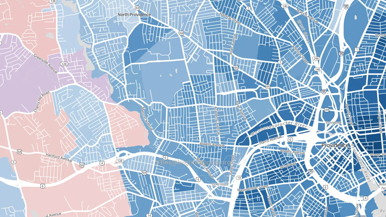
Mount Pleasant leans heavily Democratic by roughly 34 points: about 67% of voters vote Democratic and 33% Republican. These figures are model estimates: Rhode Island did not have precinct-level voting records available for training, so the numbers above come from demographic and health features rather than local ground truth.
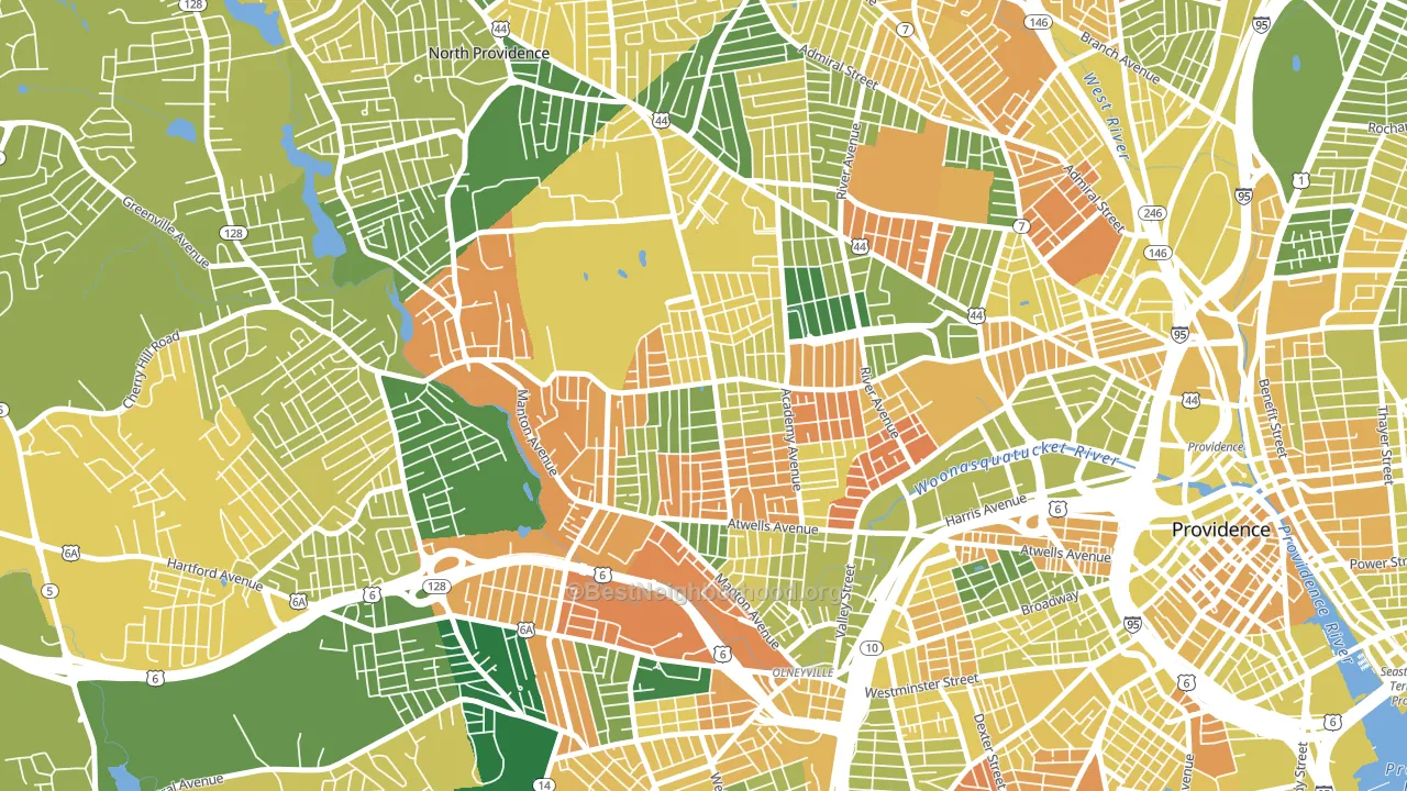
About 43% of adults in Mount Pleasant typically vote, below the U.S. average of about 62%. Among adults in Mount Pleasant, ~29% vote Democratic, ~14% Republican, and ~57% don't vote. The map below shows estimated turnout by block group.
How Mount Pleasant compares
Among neighborhoods within 5 miles, Mount Pleasant leans more Democratic than 17 of 36 neighbors.
Mount Pleasant runs about 21 points more Democratic than Rhode Island as a whole.
Politics vary noticeably by block within Mount Pleasant. The northeast side is the most Democratic-leaning (D+37) and the northwest side is the least Democratic-leaning (D+26), a spread of about 11 points.
Why Mount Pleasant leans the way it does
This analysis examined 14,881 data points per neighborhood to find what predicts political lean and turnout. The items below are a few correlations that stood out for Mount Pleasant, not a ranked or complete list of what matters most.
Areas with many never-married adults vote Democratic. About 49% of adults in Mount Pleasant have never been married, about 20 points above the U.S. average of 29%.
High-school completion and voter turnout
Places with low high-school-completion share tend to turn out at a lower rate; Mount Pleasant, Providence, RI sits in the bottom quarter nationally on this measure.
Why turnout in Mount Pleasant looks the way it does
Turnout in Mount Pleasant sits close to the national pattern. Routine healthcare access, homeownership, education, and food security all land near their national averages here. Learn more about the findings and methodology on the political spectrum map.
Nearby Neighborhoods
- Valley, Providence, RI D+38
- Olneyville, Providence, RI D+36
- Manton, Providence, RI D+27
- Elmhurst, Providence, RI D+31
- Hartford, Providence, RI D+29
- Federal Hill, Providence, RI D+60
- Smith Hill, Providence, RI D+47
- Wanskuck, Providence, RI D+40
- Silver Lake, Providence, RI D+24
- West End, Providence, RI D+48
Neighborhoods with Similar Populations
- Roosevelt Island, Manhattan, NY D+57
- Vineyard-Los Angeles, Glendale, CA D+18
- Palm Heights, San Antonio, TX D+33
- Vista Creek, Perris, CA D+22
- East Forest Park, Springfield, MA D+22
- Silver Spring, Milwaukee, WI D+74
- Steele Creek, Charlotte, NC D+44
- Center Hill, Atlanta, GA D+87
- West Adams, Los Angeles, CA D+61
- Elmwood, Providence, RI D+39
Sources and methodology
Precinct-level voting records used to fit the model come from Rhode Island Board of Elections, distributed by the Voting and Election Science Team. Demographic inputs come from the U.S. Census Bureau (ACS 5-year estimates and the 2020 Decennial Census). Health and environmental inputs come from the CDC (PLACES and the Environmental Justice Index). Land cover comes from the USGS and EPA. Election-day and lead-up weather come from PRISM 4km daily grids and the NOAA Global Historical Climatology Network. Mail-voting and election-administration patterns come from the MIT Election Lab's Survey of the Performance of American Elections. Block-group crime detail comes from CrimeGrade. Internet data and modeling support provided by ISPreports.org.
Modeling and analysis by the BestNeighborhood data science team. RI did not have precinct-level voting records available for training, so the figures here come from extrapolation across demographic, health, and land-use features rather than local ground truth. Full methodology and findings: political spectrum map.
Methodology reviewed by the BestNeighborhood data team. Last updated May 2026.