Palm Springs leans Republican by roughly 22 points: about 39% of voters vote Democratic and 61% Republican.
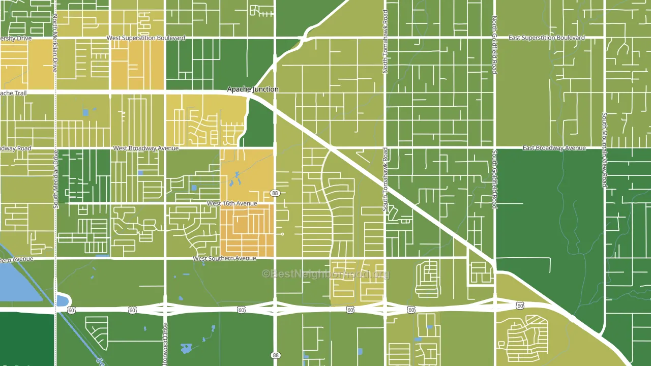
About 63% of adults in Palm Springs typically vote, near the U.S. average of about 62%. Among adults in Palm Springs, ~24% vote Democratic, ~38% Republican, and ~38% don't vote. The map below shows estimated turnout by block group.
How Palm Springs compares
Palm Springs runs about 17 points more Republican than Arizona as a whole.
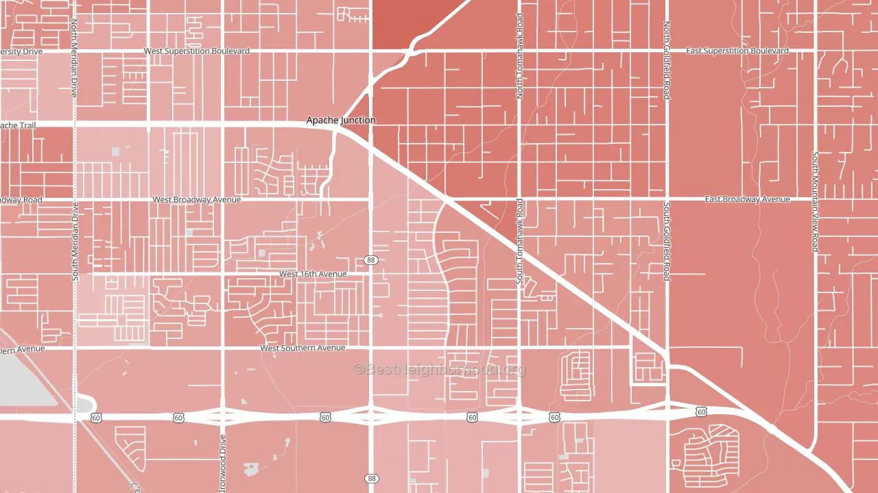
Politics vary noticeably by block within Palm Springs. The northeast side is the most Republican-leaning (R+32) and the south side is the least Republican-leaning (R+16), a spread of about 16 points.
Why Palm Springs leans the way it does
This analysis examined 14,881 data points per neighborhood to find what predicts political lean and turnout. The items below are a few correlations that stood out for Palm Springs, not a ranked or complete list of what matters most.
Car-dependent areas vote Republican. About 85% of residents in Palm Springs drive to work alone, about 11 points above the U.S. average of 74%. Low college attainment predicts Republican voting, and Palm Springs sits in the bottom quarter (about 21%, below 75% of neighborhoods).
Walkability and Republican lean
Places with a low walkability score tend to lean Republican; Palm Springs, Apache Junction, AZ sits in the bottom tenth nationally on this measure. A walkable street grid does not change how people vote; it mostly reflects how urban a place is.
Why turnout in Palm Springs looks the way it does
Turnout in Palm Springs sits close to the national pattern. Routine healthcare access, homeownership, education, and food security all land near their national averages here. Learn more about the findings and methodology on the political spectrum map.
Nearby Neighborhoods
- Southeast Mesa, Mesa, AZ R+18
- Northeast, Mesa, AZ R+20
- Castlegate, San Tan Valley, AZ R+32
- Pecan Creek, San Tan Valley, AZ R+23
- Power Ranch, Gilbert, AZ R+16
- San Tan Ranch, Gilbert, AZ R+16
- Central Mesa, Mesa, AZ R+6
- Circle Cross Ranch, San Tan Valley, AZ R+22
- Heritage District, Gilbert, AZ D+5
- Woodridge Lakes, Mesa, AZ R+12
Neighborhoods with Similar Populations
- Suburban Acres, Norfolk, VA D+36
- Central Northside, Pittsburgh, PA D+74
- Menomonee River Hills East, Milwaukee, WI D+63
- Panama Park, Jacksonville, FL D+41
- Maumee Uptown Historic District, Maumee, OH D+4
- Bayview Heights, Proctor, MN D+6
- Wester, Lubbock, TX R+11
- Sunset, Boise, ID D+44
- Orchard, Oxnard, CA D+31
- Scioto Trace, Columbus, OH D+19
Sources and methodology
Precinct-level voting records used to fit the model come from Arizona Secretary of State, Elections, distributed by the Voting and Election Science Team. Demographic inputs come from the U.S. Census Bureau (ACS 5-year estimates and the 2020 Decennial Census). Health and environmental inputs come from the CDC (PLACES and the Environmental Justice Index). Land cover comes from the USGS and EPA. Election-day and lead-up weather come from PRISM 4km daily grids and the NOAA Global Historical Climatology Network. Mail-voting and election-administration patterns come from the MIT Election Lab's Survey of the Performance of American Elections. Block-group crime detail comes from CrimeGrade. Internet data and modeling support provided by ISPreports.org.
Modeling and analysis by the BestNeighborhood data science team. Full methodology and findings: political spectrum map.
Methodology reviewed by the BestNeighborhood data team. Last updated May 2026.