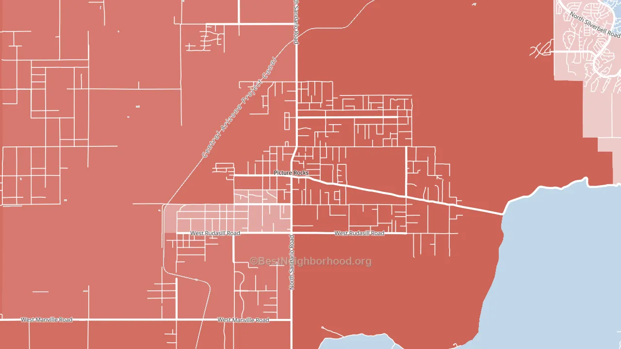
Picture Rocks leans heavily Republican by roughly 36 points: about 32% of voters vote Democratic and 68% Republican.
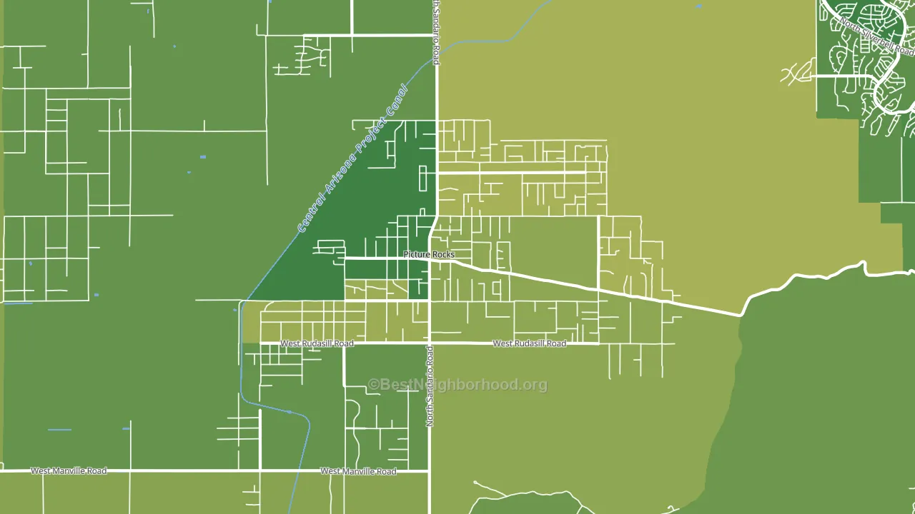
About 72% of adults in Picture Rocks typically vote, above the U.S. average of about 62%. Among adults in Picture Rocks, ~23% vote Democratic, ~49% Republican, and ~28% don't vote. The map below shows estimated turnout by block group.
How Picture Rocks compares
Among cities within 25 miles, Picture Rocks leans more Republican than 15 of 16 neighbors.
Picture Rocks runs about 31 points more Republican than Arizona as a whole.
Politics vary noticeably by neighborhood within Picture Rocks. The east side is the most Republican-leaning (R+43) and the west side is the least Republican-leaning (R+29), a spread of about 14 points.
Why Picture Rocks leans the way it does
This analysis examined 14,881 data points per city to find what predicts political lean and turnout. The items below are a few correlations that stood out for Picture Rocks, not a ranked or complete list of what matters most.
Car-dependent areas vote Republican. About 86% of residents in Picture Rocks drive to work alone, about 12 points above the U.S. average of 74%.
Walkability and Republican lean
Places with a low walkability score tend to lean Republican; Picture Rocks, AZ sits in the bottom quarter nationally on this measure. A walkable street grid does not change how people vote; it mostly reflects how urban a place is.
Why turnout in Picture Rocks looks the way it does
Homeowners vote more often than renters. About 93% of households in Picture Rocks own their home, about 20 points above the Arizona average of 73%. Learn more about the findings and methodology on the political spectrum map.
Nearby Cities
- Marana, AZ R+9
- Avra Valley, AZ R+28
- Casas Adobes, AZ D+9
- Tucson Estates, AZ Even
- Flowing Wells, AZ D+11
- Oro Valley, AZ D+3
- Valencia West, AZ D+20
- Drexel Heights, AZ D+23
- South Tucson, AZ D+44
- Red Rock, AZ R+43
Cities with Similar Populations
- Broadway, NC R+35
- Wellsville, NY R+38
- Smithsburg, MD R+39
- Pine Grove, PA R+51
- Bedford, PA R+53
- Anaconda, MT R+15
- Park City, KS R+26
- Murphy, MO R+32
- Runnemede, NJ Even
- Clinton, IL R+36
Sources and methodology
Precinct-level voting records used to fit the model come from Arizona Secretary of State, Elections, distributed by the Voting and Election Science Team. Demographic inputs come from the U.S. Census Bureau (ACS 5-year estimates and the 2020 Decennial Census). Health and environmental inputs come from the CDC (PLACES and the Environmental Justice Index). Land cover comes from the USGS and EPA. Election-day and lead-up weather come from PRISM 4km daily grids and the NOAA Global Historical Climatology Network. Mail-voting and election-administration patterns come from the MIT Election Lab's Survey of the Performance of American Elections. Block-group crime detail comes from CrimeGrade. Internet data and modeling support provided by ISPreports.org.
Modeling and analysis by the BestNeighborhood data science team. Full methodology and findings: political spectrum map.
Methodology reviewed by the BestNeighborhood data team. Last updated May 2026.