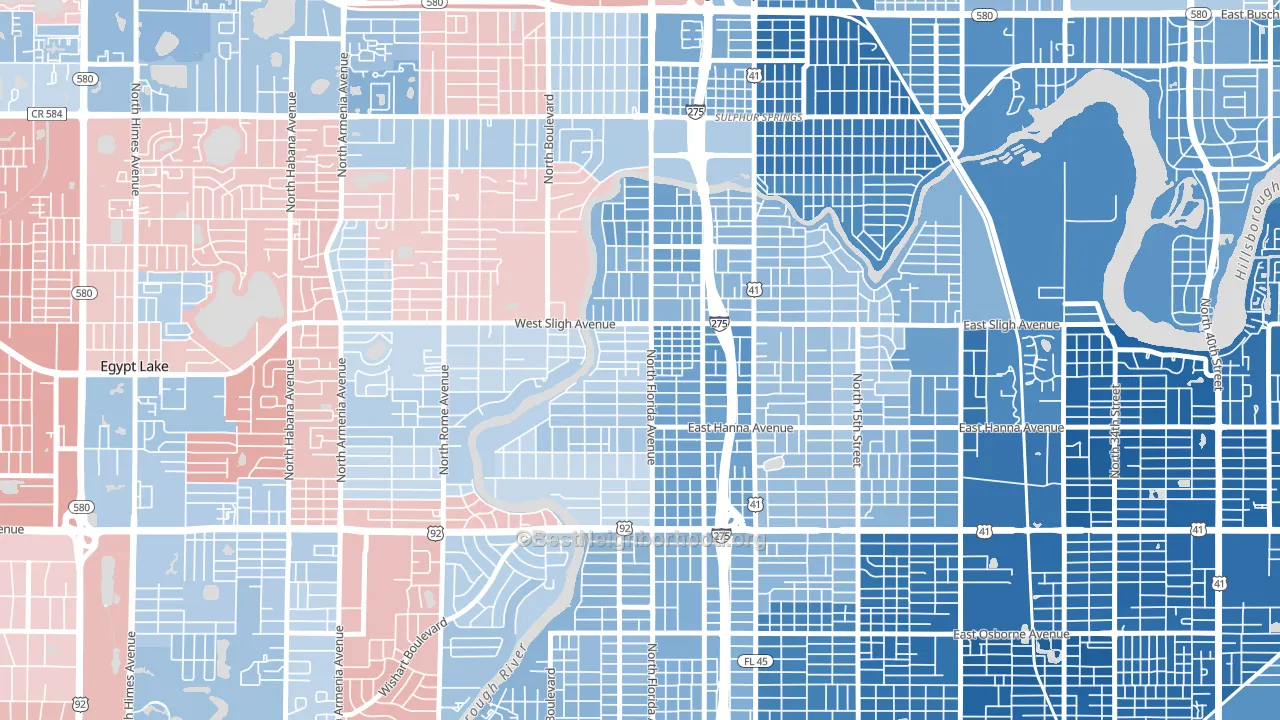
Seminole Heights leans heavily Democratic by roughly 30 points: about 65% of voters vote Democratic and 35% Republican.
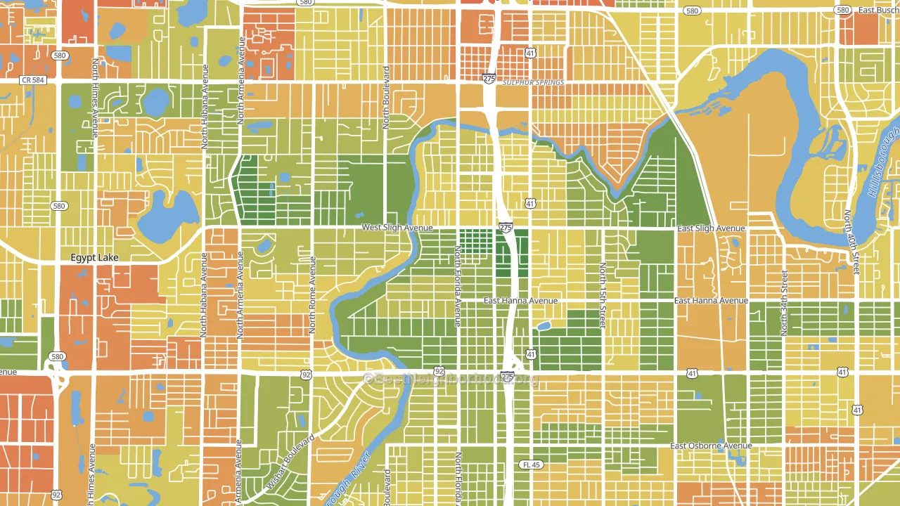
About 66% of adults in Seminole Heights typically vote, near the U.S. average of about 62%. Among adults in Seminole Heights, ~43% vote Democratic, ~23% Republican, and ~34% don't vote. The map below shows estimated turnout by block group.
How Seminole Heights compares
Among neighborhoods within 5 miles, Seminole Heights leans more Democratic than 16 of 29 neighbors.
Seminole Heights runs about 44 points more Democratic than Florida as a whole. Florida leans Republican overall, while Seminole Heights is one of the few Democratic-leaning pockets.
Politics vary noticeably by block within Seminole Heights. The east side is the most Democratic-leaning (D+47) and the southwest side is the least Democratic-leaning (D+17), a spread of about 30 points.
Why Seminole Heights leans the way it does
This analysis examined 14,881 data points per neighborhood to find what predicts political lean and turnout. The items below are a few correlations that stood out for Seminole Heights, not a ranked or complete list of what matters most.
Seminole Heights votes against the grain of Florida. Florida leans Republican overall, while Seminole Heights runs about 44 points more Democratic.
Population density and Democratic lean
Places with high population density tend to lean Democratic; Seminole Heights, Tampa, FL sits above the national average on this measure.
Why turnout in Seminole Heights looks the way it does
Turnout in Seminole Heights sits close to the national pattern. Routine healthcare access, homeownership, education, and food security all land near their national averages here. Learn more about the findings and methodology on the political spectrum map.
Nearby Neighborhoods
- Old Seminol Heights, Tampa, FL D+36
- Riverbend, Tampa, FL D+3
- South Seminole Heights, Tampa, FL D+32
- Lowry Park Central, Tampa, FL D+3
- Sulphur Springs, Tampa, FL D+43
- Wellswood, Tampa, FL D+2
- Live Oaks Square, Tampa, FL D+69
- Plaza Terrace, Tampa, FL D+7
- Riverside Heights, Tampa, FL D+21
- East Tampa, Tampa, FL D+66
Neighborhoods with Similar Populations
- Congdon Park, Duluth, MN D+53
- Nauck, Arlington, VA D+67
- Eastland, Columbus, OH D+59
- Woodlake, San Antonio, TX D+28
- Harwood Lane, Charlotte, NC D+37
- Northern Hills, San Antonio, TX D+3
- Eastland-Wilora Lake, Charlotte, NC D+53
- Ballast Point, Tampa, FL R+11
- Waterfront, Santa Barbara, CA D+55
- Kendrick Lake, Lakewood, CO D+16
Sources and methodology
Precinct-level voting records used to fit the model come from Florida Division of Elections, distributed by the Voting and Election Science Team. Demographic inputs come from the U.S. Census Bureau (ACS 5-year estimates and the 2020 Decennial Census). Health and environmental inputs come from the CDC (PLACES and the Environmental Justice Index). Land cover comes from the USGS and EPA. Election-day and lead-up weather come from PRISM 4km daily grids and the NOAA Global Historical Climatology Network. Mail-voting and election-administration patterns come from the MIT Election Lab's Survey of the Performance of American Elections. Block-group crime detail comes from CrimeGrade. Internet data and modeling support provided by ISPreports.org.
Modeling and analysis by the BestNeighborhood data science team. Full methodology and findings: political spectrum map.
Methodology reviewed by the BestNeighborhood data team. Last updated May 2026.