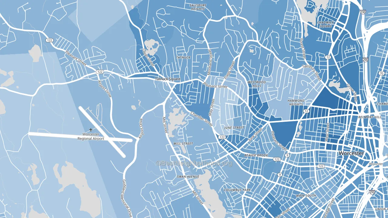
Tatnuck leans heavily Democratic by roughly 32 points: about 66% of voters vote Democratic and 34% Republican.
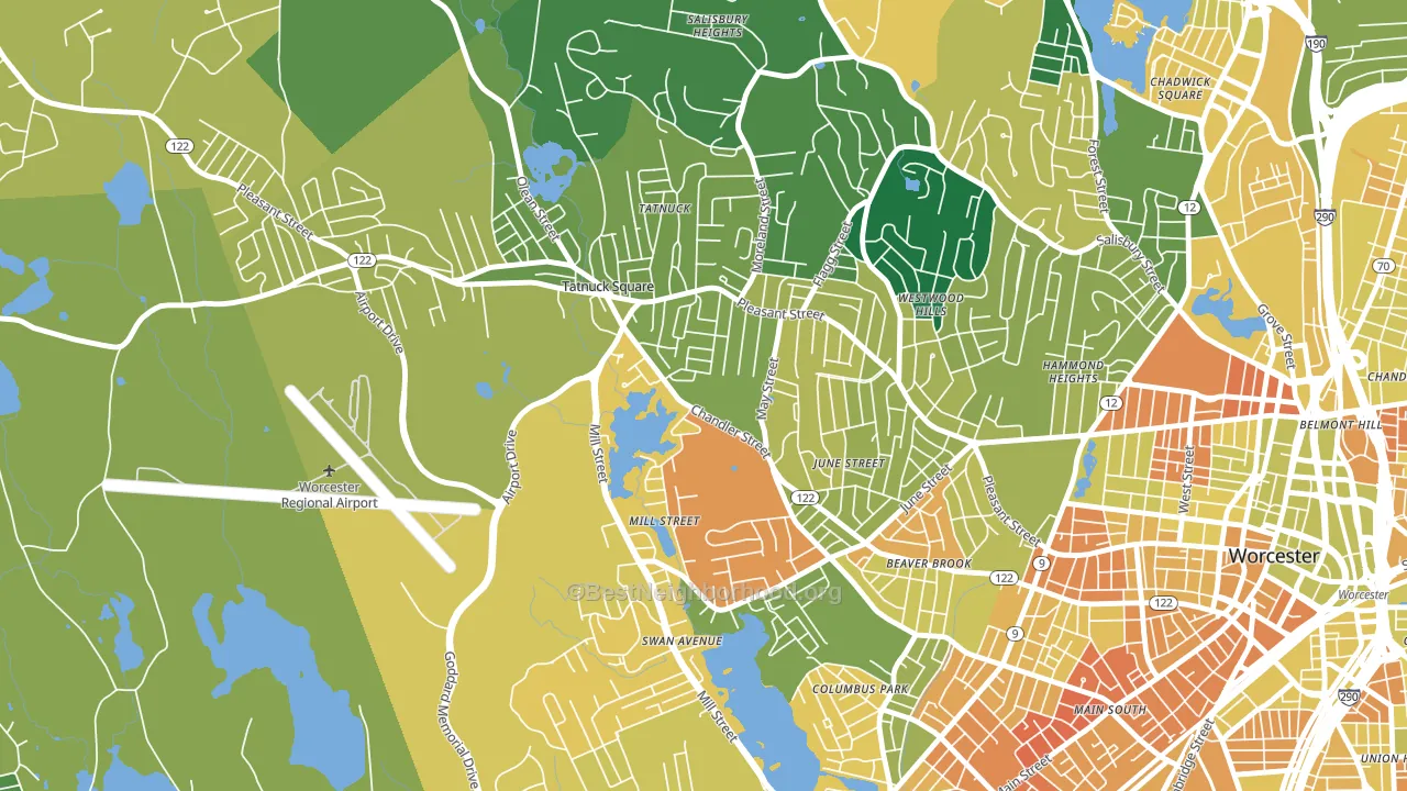
About 63% of adults in Tatnuck typically vote, near the U.S. average of about 62%. Among adults in Tatnuck, ~42% vote Democratic, ~21% Republican, and ~37% don't vote. The map below shows estimated turnout by block group.
How Tatnuck compares
Among neighborhoods within 5 miles, Tatnuck leans more Democratic than 15 of 25 neighbors.
Tatnuck runs about 8 points more Democratic than Massachusetts as a whole.
Politics vary noticeably by block within Tatnuck. The south side is the most Democratic-leaning (D+38) and the west side is the least Democratic-leaning (D+25), a spread of about 13 points.
Why Tatnuck leans the way it does
This analysis examined 14,881 data points per neighborhood to find what predicts political lean and turnout. The items below are a few correlations that stood out for Tatnuck, not a ranked or complete list of what matters most.
Areas with many never-married adults vote Democratic. About 51% of adults in Tatnuck have never been married, modestly above similar-sized neighborhoods (around 42%).
Population density and Democratic lean
Places with high population density tend to lean Democratic; Tatnuck, Worcester, MA sits above the national average on this measure.
Why turnout in Tatnuck looks the way it does
Areas with strong routine healthcare access turn out at higher rates. Tatnuck is in the top quarter nationally for routine-care measures such as insurance coverage, preventive screenings, and dental visits. The dental-visit rate here is about 71%, about 11 points above the U.S. average of 60%. Learn more about the findings and methodology on the political spectrum map.
Nearby Neighborhoods
- Newton Square, Worcester, MA D+31
- Salisbury Street, Worcester, MA D+35
- Columbus Park, Worcester, MA D+29
- Main Middle, Worcester, MA D+31
- Forest Grove, Worcester, MA D+30
- University Park, Worcester, MA D+36
- Institute Park, Worcester, MA D+50
- Indian Lake East, Worcester, MA D+36
- Central Business District, Worcester, MA D+42
- South Worcester, Worcester, MA D+26
Neighborhoods with Similar Populations
- Mid City-Santa Ana, Santa Ana, CA D+33
- Plymouth Colony, Atlanta, GA D+45
- Pembroke Falls, Pembroke Pines, FL D+11
- Gladstone, Chicago, IL D+23
- South Collinwood, Cleveland, OH D+83
- Upper B Street, Hayward, CA D+45
- Rolando, San Diego, CA D+42
- Greater South Side, Des Moines, IA D+12
- Pecan Creek, San Tan Valley, AZ R+23
- Pico-Lowell, Santa Ana, CA D+34
Sources and methodology
Precinct-level voting records used to fit the model come from Massachusetts Secretary of the Commonwealth, Elections, distributed by the Voting and Election Science Team. Demographic inputs come from the U.S. Census Bureau (ACS 5-year estimates and the 2020 Decennial Census). Health and environmental inputs come from the CDC (PLACES and the Environmental Justice Index). Land cover comes from the USGS and EPA. Election-day and lead-up weather come from PRISM 4km daily grids and the NOAA Global Historical Climatology Network. Mail-voting and election-administration patterns come from the MIT Election Lab's Survey of the Performance of American Elections. Block-group crime detail comes from CrimeGrade. Internet data and modeling support provided by ISPreports.org.
Modeling and analysis by the BestNeighborhood data science team. Full methodology and findings: political spectrum map.
Methodology reviewed by the BestNeighborhood data team. Last updated May 2026.