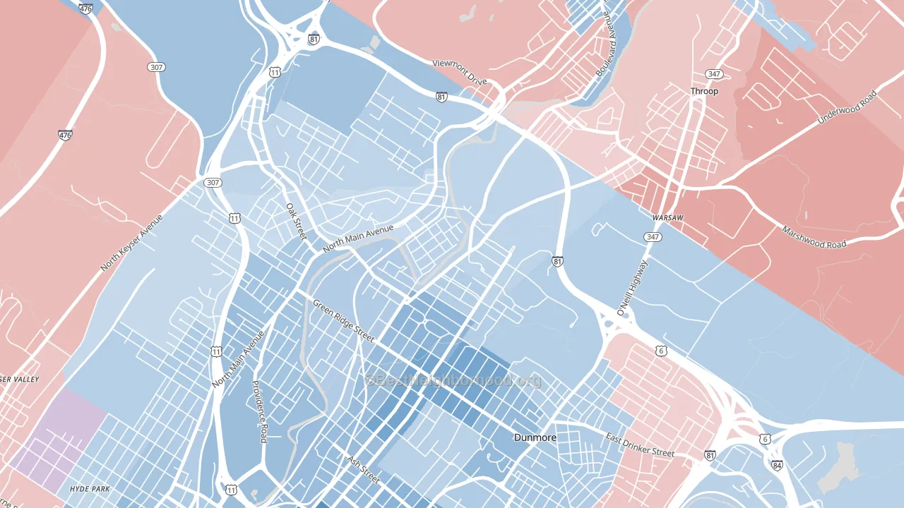
The Plot leans slightly Democratic by roughly 12 points: about 56% of voters vote Democratic and 44% Republican.
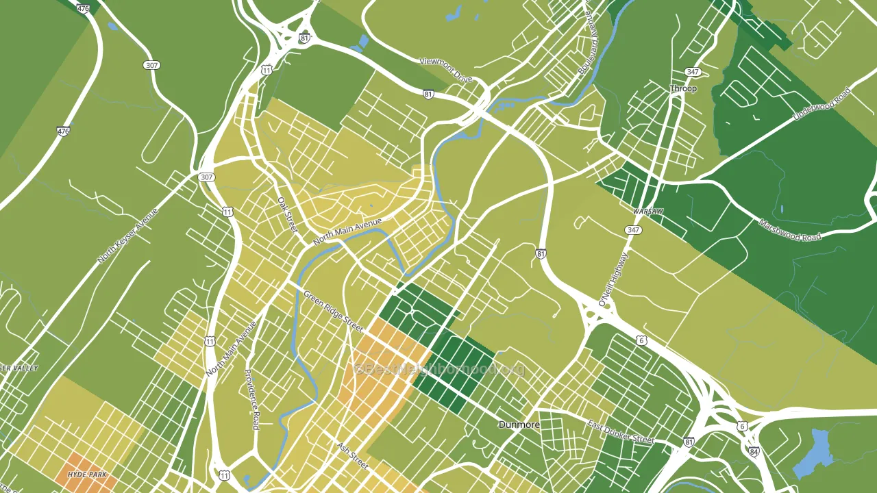
About 63% of adults in The Plot typically vote, near the U.S. average of about 62%. Among adults in The Plot, ~35% vote Democratic, ~28% Republican, and ~37% don't vote. The map below shows estimated turnout by block group.
How The Plot compares
Among neighborhoods within 5 miles, The Plot leans more Democratic than 2 of 7 neighbors.
The Plot runs about 14 points more Democratic than Pennsylvania as a whole. Pennsylvania is roughly evenly split, and The Plot sits clearly on the Democratic side.
Politics vary noticeably by block within The Plot. The northeast side is the most Democratic-leaning (D+21) and the north side is the least Democratic-leaning (D+4), a spread of about 17 points.
Why The Plot leans the way it does
This analysis examined 14,881 data points per neighborhood to find what predicts political lean and turnout. The items below are a few correlations that stood out for The Plot, not a ranked or complete list of what matters most.
The Plot votes against the grain of Pennsylvania. Pennsylvania is roughly evenly split, while The Plot runs about 14 points more Democratic. A high white share with below-average college attainment predicts Republican voting, and The Plot fits that profile on both counts.
Cancer-screening access and voter turnout
Places with high colon-cancer-screening access tend to turn out at a higher rate; The Plot, Scranton, PA sits above the national average on this measure. Cancer screening does not drive turnout; it reflects income, insurance, and healthcare access.
Why turnout in The Plot looks the way it does
Turnout in The Plot sits close to the national pattern. Routine healthcare access, homeownership, education, and food security all land near their national averages here. Learn more about the findings and methodology on the political spectrum map.
Nearby Neighborhoods
- Green Ridge, Scranton, PA D+17
- Providence, Scranton, PA D+10
- The Hill Section, Scranton, PA D+23
- Petersburg, Scranton, PA D+20
- Downtown, Scranton, PA D+28
- West Side, Scranton, PA D+8
- South Side, Scranton, PA D+16
- Parsons, Wilkes-Barre, PA R+9
- North End, Wilkes-Barre, PA D+16
- Mayflower, Wilkes-Barre, PA D+12
Neighborhoods with Similar Populations
- Century Village, West Palm Beach, FL D+11
- Mission Valley East, San Diego, CA D+33
- Lake Lucina, Jacksonville, FL D+15
- Yorktown, Huntington Beach, CA Even
- Gravois Park, St. Louis, MO D+72
- Parkwood Maintenance, San Antonio, TX D+11
- Athenia, Clifton, NJ D+5
- Far West, Wilsonville, OR D+18
- Geneva, Orem, UT R+17
- 9th and 9th, Salt Lake City, UT D+70
Sources and methodology
Precinct-level voting records used to fit the model come from Pennsylvania Department of State, Bureau of Elections, distributed by the Voting and Election Science Team. Demographic inputs come from the U.S. Census Bureau (ACS 5-year estimates and the 2020 Decennial Census). Health and environmental inputs come from the CDC (PLACES and the Environmental Justice Index). Land cover comes from the USGS and EPA. Election-day and lead-up weather come from PRISM 4km daily grids and the NOAA Global Historical Climatology Network. Mail-voting and election-administration patterns come from the MIT Election Lab's Survey of the Performance of American Elections. Block-group crime detail comes from CrimeGrade. Internet data and modeling support provided by ISPreports.org.
Modeling and analysis by the BestNeighborhood data science team. Full methodology and findings: political spectrum map.
Methodology reviewed by the BestNeighborhood data team. Last updated May 2026.