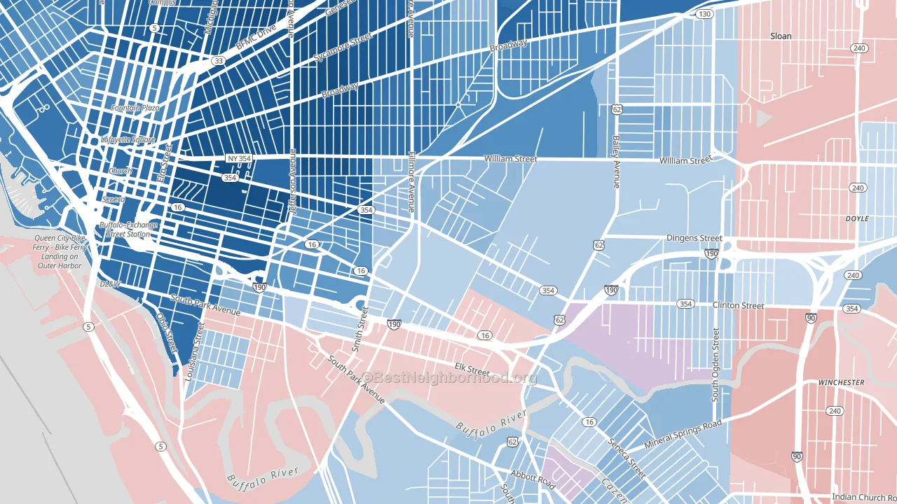
Babcock leans slightly Democratic by roughly 10 points: about 55% of voters vote Democratic and 45% Republican.
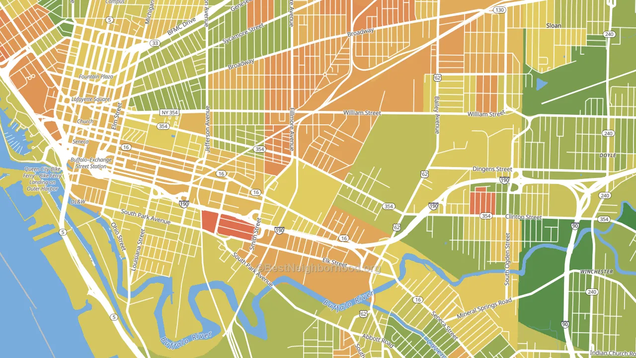
About 40% of adults in Babcock typically vote, below the U.S. average of about 62%. Among adults in Babcock, ~22% vote Democratic, ~18% Republican, and ~60% don't vote. The map below shows estimated turnout by block group.
How Babcock compares
Among neighborhoods within 5 miles, Babcock leans more Democratic than 4 of 32 neighbors.
Politically, Babcock sits close to the rest of New York.
Politics vary noticeably by block within Babcock. The northeast side runs the most Democratic (D+23) and the southwest side runs the most Republican (Even), a spread of about 24 points.
Why Babcock leans the way it does
This analysis examined 14,881 data points per neighborhood to find what predicts political lean and turnout. The items below are a few correlations that stood out for Babcock, not a ranked or complete list of what matters most.
Areas with many never-married adults vote Democratic. About 52% of adults in Babcock have never been married, well above similar-sized neighborhoods (around 32%).
Paved land cover and Democratic lean
Places with extensive paved surfaces tend to lean Democratic; Babcock, Buffalo, NY sits in the top tenth nationally on this measure. Paved ground does not change how people vote; it mostly reflects how urban and built-up a place is.
Why turnout in Babcock looks the way it does
Areas with high food insecurity turn out at lower rates. About 33% of adults in Babcock report food insecurity, about 16 points above the U.S. average of 16%. Low high-school completion lines up with lower turnout, and about 79% of adults in Babcock have completed high school, below 86% of neighborhoods. High-crime urban areas turn out at lower rates, and Babcock sits in the top 15% on a violent-crime measure. Learn more about the findings and methodology on the political spectrum map.
Nearby Neighborhoods
- Larkinville, Buffalo, NY D+63
- Broadway-Fillmore, Buffalo, NY D+47
- Seneca, Buffalo, NY D+6
- Kaisertown, Buffalo, NY D+6
- Willert Park, Buffalo, NY D+83
- Lovejoy, Buffalo, NY D+20
- Triangle, Buffalo, NY D+12
- Abbott McKinley, Buffalo, NY D+16
- Central Business District-Buffalo, Buffalo, NY D+61
- Cazenovia Park, Buffalo, NY D+12
Neighborhoods with Similar Populations
- Pleasant Acres, New Milford, NJ Even
- Arrowhead, Jacksonville, FL R+16
- Pioneer Park, Des Moines, IA D+22
- Cedar-Isles-Dean, Minneapolis, MN D+65
- Wilmington Historic District, Wilmington, OH R+27
- Merriwood, Oakland, CA D+64
- Seven Oaks, Bakersfield, CA R+28
- Bardonia, West Nyack, NY R+7
- New Village, New River, AZ R+30
- Fairfield, Erie, PA R+4
Sources and methodology
Precinct-level voting records used to fit the model come from New York State Board of Elections, distributed by the Voting and Election Science Team. Demographic inputs come from the U.S. Census Bureau (ACS 5-year estimates and the 2020 Decennial Census). Health and environmental inputs come from the CDC (PLACES and the Environmental Justice Index). Land cover comes from the USGS and EPA. Election-day and lead-up weather come from PRISM 4km daily grids and the NOAA Global Historical Climatology Network. Mail-voting and election-administration patterns come from the MIT Election Lab's Survey of the Performance of American Elections. Block-group crime detail comes from CrimeGrade. Internet data and modeling support provided by ISPreports.org.
Modeling and analysis by the BestNeighborhood data science team. Full methodology and findings: political spectrum map.
Methodology reviewed by the BestNeighborhood data team. Last updated May 2026.