Abbott McKinley leans Democratic by roughly 16 points: about 58% of voters vote Democratic and 42% Republican.
[sc name="abovemapcta"]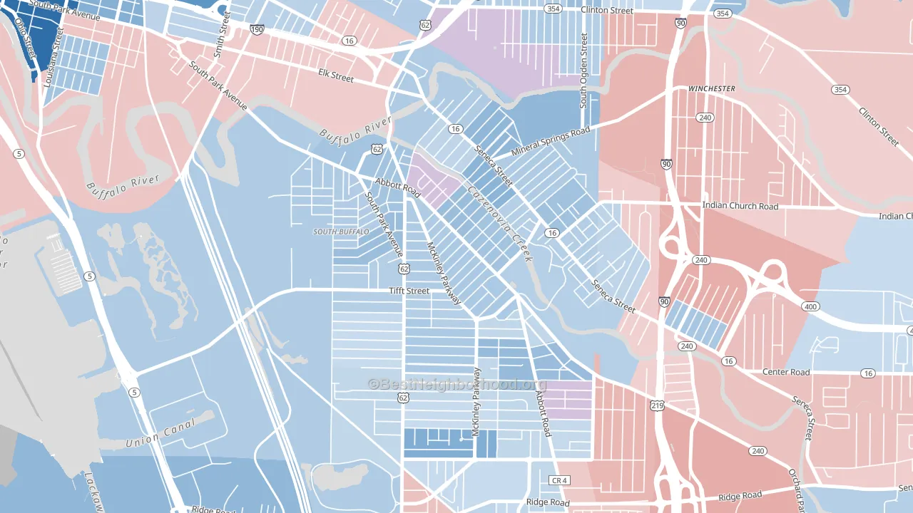 [bestneighborhood_map_controls]
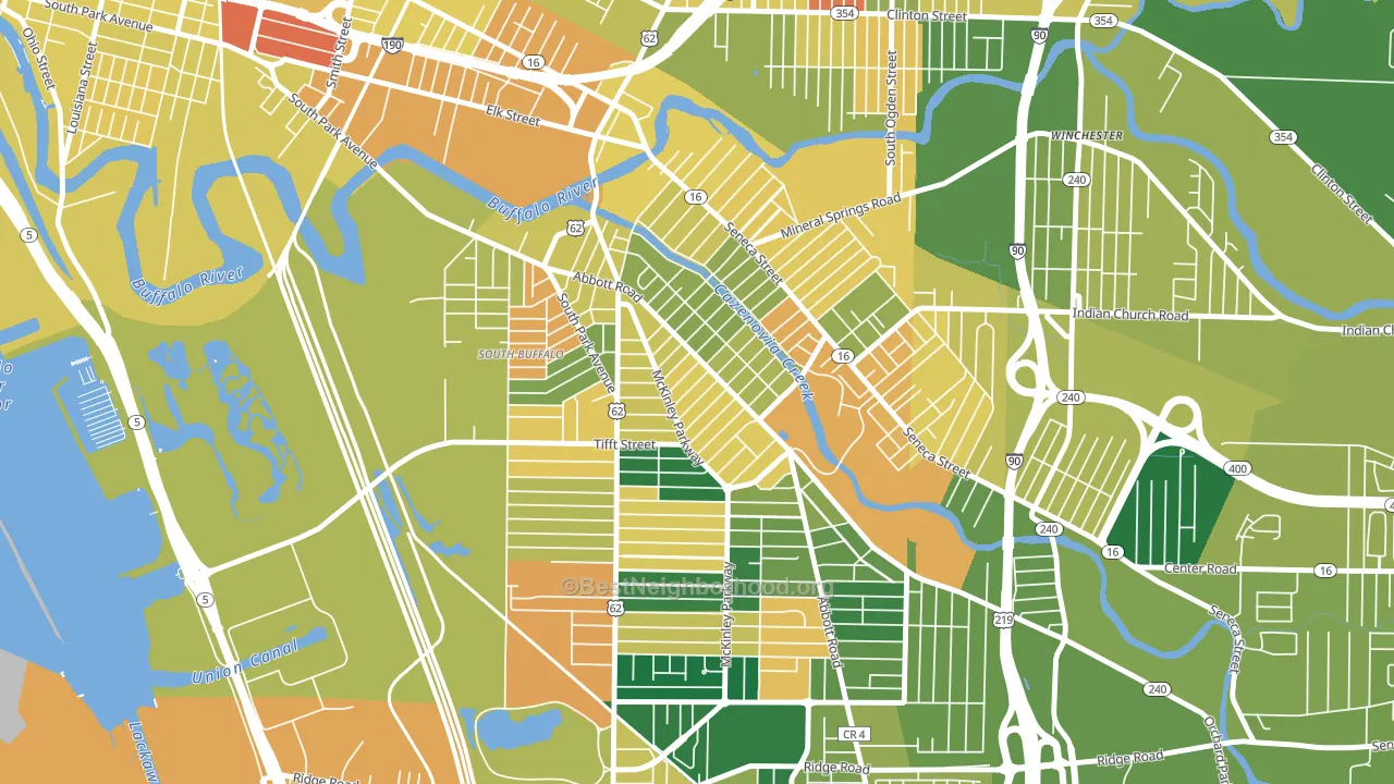
About 67% of adults in Abbott McKinley typically vote, near the U.S. average of about 62%. Among adults in Abbott McKinley, ~39% vote Democratic, ~28% Republican, and ~33% don't vote. The map below shows estimated turnout by block group.
 [bestneighborhood_map_controls]
How Abbott McKinley compares
Among neighborhoods within 5 miles, Abbott McKinley leans more Democratic than 7 of 20 neighbors.
Politically, Abbott McKinley sits close to the rest of New York.
Why Abbott McKinley leans the way it does
Density, race composition, education, and family structure all sit close to their national averages in Abbott McKinley. The lean here lands roughly where demographic data alone would predict.
Paved land cover and Democratic lean
Places with extensive paved surfaces tend to lean Democratic; Abbott McKinley, Buffalo, NY sits in the top tenth nationally on this measure. Paved ground does not change how people vote; it mostly reflects how urban and built-up a place is.
Why turnout in Abbott McKinley looks the way it does
Turnout in Abbott McKinley sits close to the national pattern. Routine healthcare access, homeownership, education, and food security all land near their national averages here. Learn more about the findings and methodology on the political spectrum map.
[one_half]Nearby Neighborhoods
- Triangle, Buffalo, NY D+12
- Cazenovia Park, Buffalo, NY D+12
- Seneca, Buffalo, NY D+6
- South Park, Buffalo, NY D+7
- South Abbott, Buffalo, NY D+6
- Kaisertown, Buffalo, NY D+6
- Babcock, Buffalo, NY D+10
- Larkinville, Buffalo, NY D+63
- Lovejoy, Buffalo, NY D+20
- Broadway-Fillmore, Buffalo, NY D+47
Neighborhoods with Similar Populations
- Southgate, Hayward, CA D+39
- North Quinsigamond Village, Worcester, MA D+37
- University of NC at Chapel Hill, Chapel Hill, NC D+72
- Carondelet, St. Louis, MO D+51
- North Lamar, Austin, TX D+37
- Queensborough, Shreveport, LA D+84
- Central City Santa Ana, Santa Ana, CA D+32
- Bronze Boot, Phoenix, AZ D+36
- Duncan Park, Lexington, KY D+68
- Euclid-St Paul, St. Petersburg, FL D+18
Sources and methodology
Precinct-level voting records used to fit the model come from New York State Board of Elections, distributed by the Voting and Election Science Team. Demographic inputs come from the U.S. Census Bureau (ACS 5-year estimates and the 2020 Decennial Census). Health and environmental inputs come from the CDC (PLACES and the Environmental Justice Index). Land cover comes from the USGS and EPA. Election-day and lead-up weather come from PRISM 4km daily grids and the NOAA Global Historical Climatology Network. Mail-voting and election-administration patterns come from the MIT Election Lab's Survey of the Performance of American Elections. Block-group crime detail comes from CrimeGrade. Internet data and modeling support provided by ISPreports.org.
Modeling and analysis by the BestNeighborhood data science team. Full methodology and findings: political spectrum map.
Methodology reviewed by the BestNeighborhood data team. Last updated May 2026.