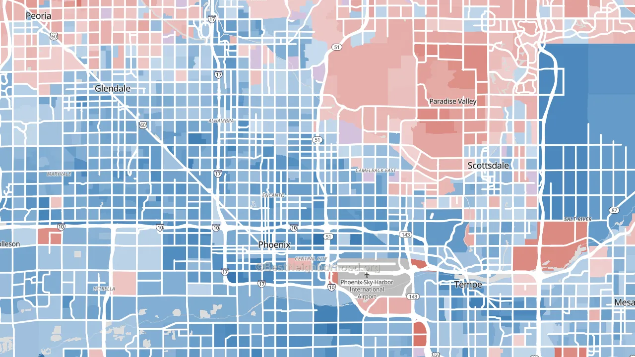
Maricopa County is a true toss-up. About 51% of voters here vote Democratic and 49% Republican.
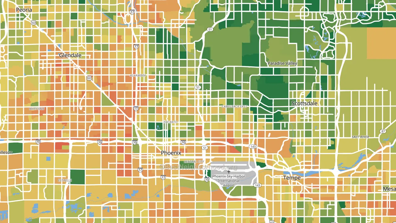
About 64% of adults in Maricopa County typically vote, near the U.S. average of about 62%. Among adults in Maricopa County, ~33% vote Democratic, ~31% Republican, and ~36% don't vote. The map below shows estimated turnout by block group.
How Maricopa County compares
Maricopa County runs about 9 points more Democratic than Arizona as a whole.
Politics vary noticeably by city within Maricopa County. The south side runs the most Democratic (D+25) and the northwest side runs the most Republican (R+17), a spread of about 41 points.
Why Maricopa County leans the way it does
Density, race composition, education, and family structure all sit close to their national averages in Maricopa County. The lean here lands roughly where demographic data alone would predict.
Population density and Democratic lean
Places with high population density tend to lean Democratic; Maricopa County, AZ sits in the top tenth nationally on this measure.
Why turnout in Maricopa County looks the way it does
Areas with limited routine healthcare access turn out at lower rates. Maricopa County is in the bottom quarter nationally for routine-care measures such as insurance coverage, preventive screenings, and dental visits. Learn more about the findings and methodology on the political spectrum map.
Nearby Counties
- Pinal County, AZ R+16
- Gila County, AZ R+27
- Yavapai County, AZ R+22
- Pima County, AZ D+16
- La Paz County, AZ R+28
- Graham County, AZ R+39
- Coconino County, AZ D+21
- Navajo County, AZ R+3
- Santa Cruz County, AZ D+17
- Yuma County, AZ R+8
Counties with Similar Populations
- Harris County, TX D+13
- Cook County, IL D+42
- San Diego County, CA D+17
- Orange County, CA D+6
- Kings County, NY D+34
- Miami-Dade County, FL R+8
- Dallas County, TX D+27
- Riverside County, CA Even
- Queens County, NY D+23
- King County, WA D+45
Sources and methodology
Precinct-level voting records used to fit the model come from Arizona Secretary of State, Elections, distributed by the Voting and Election Science Team. Demographic inputs come from the U.S. Census Bureau (ACS 5-year estimates and the 2020 Decennial Census). Health and environmental inputs come from the CDC (PLACES and the Environmental Justice Index). Land cover comes from the USGS and EPA. Election-day and lead-up weather come from PRISM 4km daily grids and the NOAA Global Historical Climatology Network. Mail-voting and election-administration patterns come from the MIT Election Lab's Survey of the Performance of American Elections. Block-group crime detail comes from CrimeGrade. Internet data and modeling support provided by ISPreports.org.
Modeling and analysis by the BestNeighborhood data science team. Full methodology and findings: political spectrum map.
Methodology reviewed by the BestNeighborhood data team. Last updated May 2026.