Oregon leans slightly Democratic by roughly 14 points: about 57% of voters vote Democratic and 43% Republican.
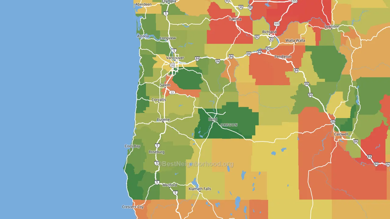
About 74% of adults in Oregon typically vote, above the U.S. average of about 62%. Among adults in Oregon, ~42% vote Democratic, ~32% Republican, and ~26% don't vote. The map below shows estimated turnout by block group.
How Oregon compares
Among states within 500 miles, Oregon leans more Democratic than 2 of 3 neighbors.
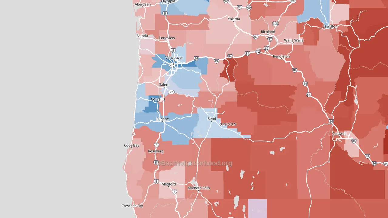
Politics vary noticeably by county within Oregon. The north side runs the most Democratic (D+39) and the southeast side runs the most Republican (R+24), a spread of about 63 points.
Why Oregon leans the way it does
Density, race composition, education, and family structure all sit close to their national averages in Oregon. The lean here lands roughly where demographic data alone would predict.
Walkability and Democratic lean
Places with a highly walkable street grid tend to lean Democratic; Oregon sits in the top tenth nationally on this measure. A walkable street grid does not change how people vote; it mostly reflects how urban a place is.
Why turnout in Oregon looks the way it does
Turnout in Oregon sits close to the national pattern. Routine healthcare access, homeownership, education, and food security all land near their national averages here. Learn more about the findings and methodology on the political spectrum map.
Nearby States
- Washington D+16
- Idaho R+34
- Nevada D+5
- Montana R+20
- California D+20
- Utah R+19
- Wyoming R+41
- Arizona Even
- Colorado D+12
- North Dakota R+30
States with Similar Populations
- Kentucky R+28
- Oklahoma R+26
- Louisiana R+13
- Alabama R+23
- South Carolina R+12
- Utah R+19
- Iowa R+12
- Nevada D+5
- Arkansas R+25
- Mississippi R+13
Sources and methodology
Precinct-level voting records used to fit the model come from Oregon Secretary of State, Elections Division, distributed by the Voting and Election Science Team. Demographic inputs come from the U.S. Census Bureau (ACS 5-year estimates and the 2020 Decennial Census). Health and environmental inputs come from the CDC (PLACES and the Environmental Justice Index). Land cover comes from the USGS and EPA. Election-day and lead-up weather come from PRISM 4km daily grids and the NOAA Global Historical Climatology Network. Mail-voting and election-administration patterns come from the MIT Election Lab's Survey of the Performance of American Elections. Block-group crime detail comes from CrimeGrade. Internet data and modeling support provided by ISPreports.org.
Modeling and analysis by the BestNeighborhood data science team. Full methodology and findings: political spectrum map.
Methodology reviewed by the BestNeighborhood data team. Last updated May 2026.