Plymouth-Exchange is a Democratic stronghold. About 87% of voters here vote Democratic and 13% Republican.
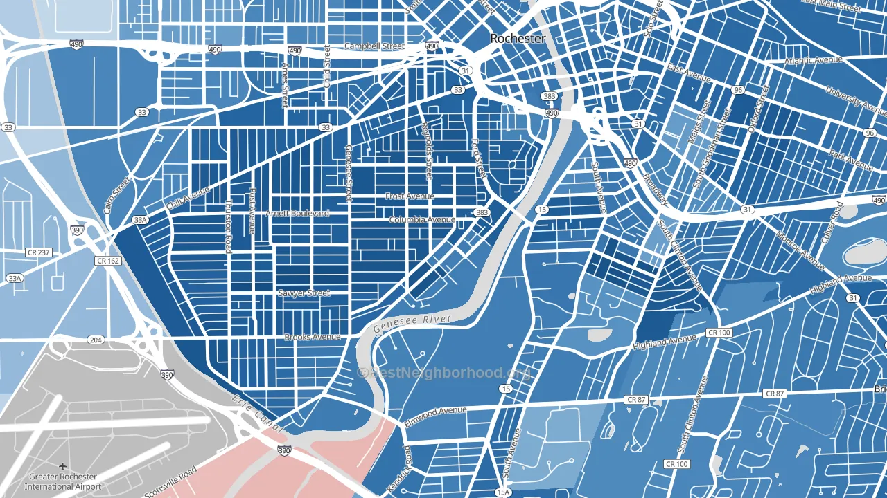
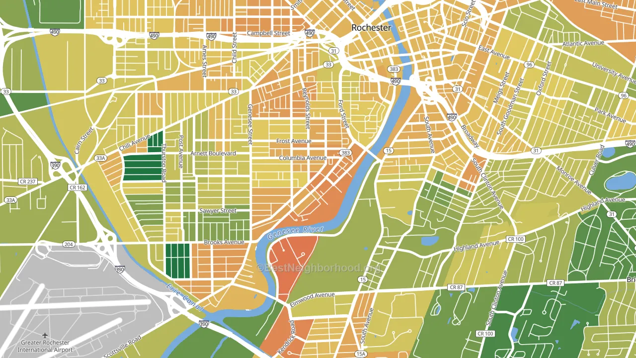
About 31% of adults in Plymouth-Exchange typically vote, below the U.S. average of about 62%. Among adults in Plymouth-Exchange, ~27% vote Democratic, ~4% Republican, and ~69% don't vote. The map below shows estimated turnout by block group.
How Plymouth-Exchange compares
Among neighborhoods within 5 miles, Plymouth-Exchange leans more Democratic than 25 of 27 neighbors.
Plymouth-Exchange runs about 62 points more Democratic than New York as a whole.
Politics vary noticeably by block within Plymouth-Exchange. The northwest side is the most Democratic-leaning (D+82) and the south side is the least Democratic-leaning (D+68), a spread of about 14 points.
Why Plymouth-Exchange leans the way it does
This analysis examined 14,881 data points per neighborhood to find what predicts political lean and turnout. The items below are a few correlations that stood out for Plymouth-Exchange, not a ranked or complete list of what matters most.
Areas with many never-married adults vote Democratic. About 69% of adults in Plymouth-Exchange have never been married, well above similar-sized neighborhoods (around 45%).
Preventive-care access and voter turnout
Places with limited routine preventive-care access tend to turn out at a lower rate; Plymouth-Exchange, Rochester, NY sits in the bottom tenth nationally on this measure. Dental visits do not drive turnout; the rate reflects income, insurance, and healthcare access, which line up with who votes.
Why turnout in Plymouth-Exchange looks the way it does
Renters vote less often than owners. About 83% of households in Plymouth-Exchange rent, about 58 points above the U.S. average of 25%. High food insecurity lines up with lower turnout, and about 46% of adults in Plymouth-Exchange report food insecurity, above 97% of neighborhoods. Low high-school completion lines up with lower turnout, and about 78% of adults in Plymouth-Exchange have completed high school, below 87% of neighborhoods. Learn more about the findings and methodology on the political spectrum map.
Nearby Neighborhoods
- Genesee-Jefferson, Rochester, NY D+81
- Corn Hill, Rochester, NY D+62
- Strong, Rochester, NY D+60
- South Wedge, Rochester, NY D+70
- 19th Ward, Rochester, NY D+78
- Ellwanger-Barry, Rochester, NY D+68
- Highland, Rochester, NY D+60
- Pearl-Meigs-Monroe, Rochester, NY D+61
- Central Business District-Rochester, Rochester, NY D+64
- Dutchtown, Rochester, NY D+56
Neighborhoods with Similar Populations
- Downtown Sacramento, Sacramento, CA D+46
- Confederate Point, Jacksonville, FL D+20
- Melrose-Rugby, Roanoke, VA D+81
- Wasatch Hollow, Salt Lake City, UT D+67
- East Meyer, Kansas City, MO D+80
- Canterbury Green, Fort Wayne, IN D+21
- Garden City, Cranston, RI D+10
- Las Palmas, San Antonio, TX D+35
- Sun Willows, Pasco, WA D+13
- Eastside, Binghamton, NY D+15
Sources and methodology
Precinct-level voting records used to fit the model come from New York State Board of Elections, distributed by the Voting and Election Science Team. Demographic inputs come from the U.S. Census Bureau (ACS 5-year estimates and the 2020 Decennial Census). Health and environmental inputs come from the CDC (PLACES and the Environmental Justice Index). Land cover comes from the USGS and EPA. Election-day and lead-up weather come from PRISM 4km daily grids and the NOAA Global Historical Climatology Network. Mail-voting and election-administration patterns come from the MIT Election Lab's Survey of the Performance of American Elections. Block-group crime detail comes from CrimeGrade. Internet data and modeling support provided by ISPreports.org.
Modeling and analysis by the BestNeighborhood data science team. Full methodology and findings: political spectrum map.
Methodology reviewed by the BestNeighborhood data team. Last updated May 2026.