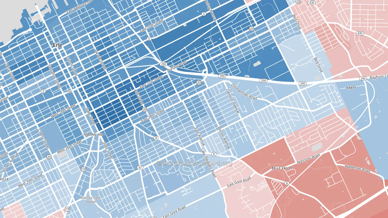
Southeast Erie leans Democratic by roughly 20 points: about 60% of voters vote Democratic and 40% Republican.
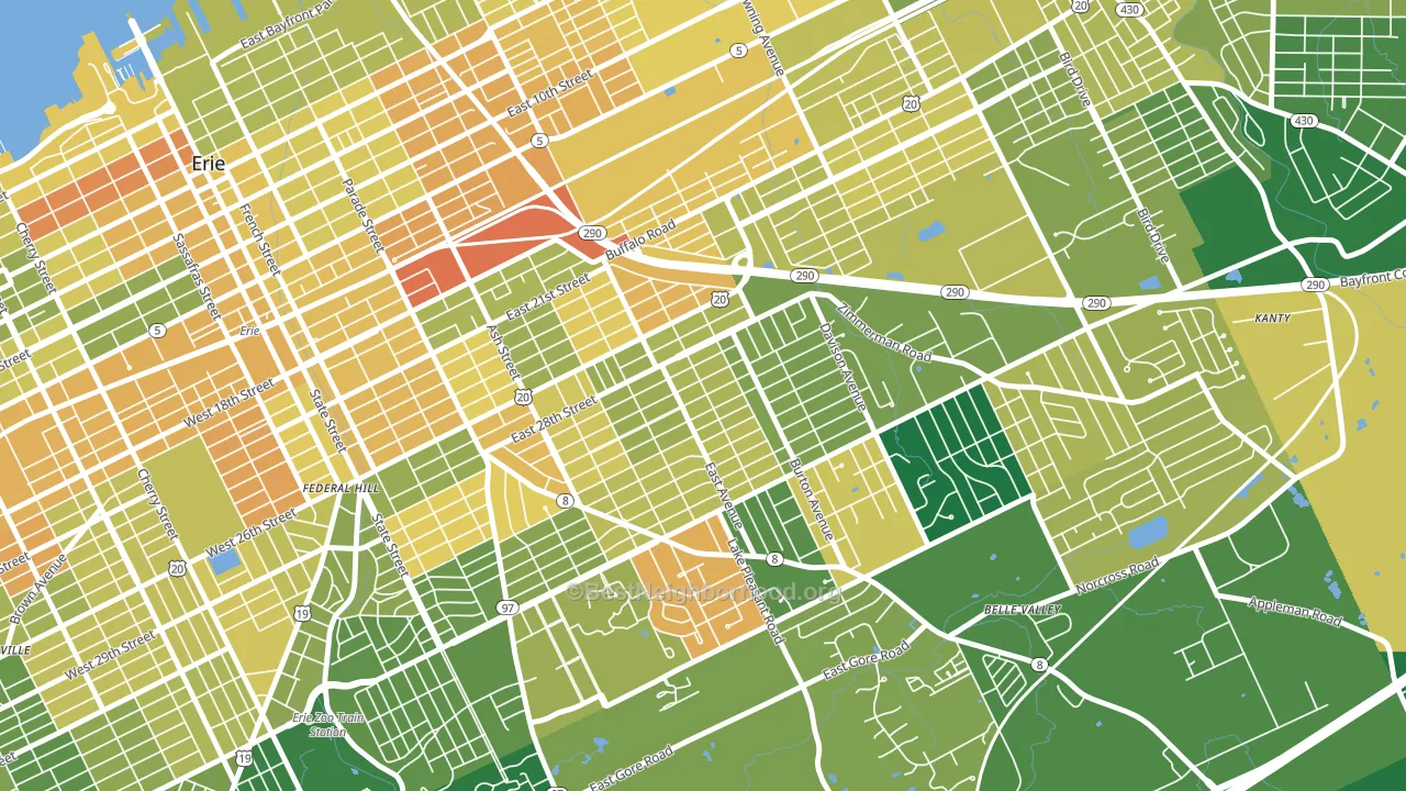
About 66% of adults in Southeast Erie typically vote, near the U.S. average of about 62%. Among adults in Southeast Erie, ~40% vote Democratic, ~26% Republican, and ~34% don't vote. The map below shows estimated turnout by block group.
How Southeast Erie compares
Among neighborhoods within 5 miles, Southeast Erie leans more Democratic than 5 of 12 neighbors.
Southeast Erie runs about 22 points more Democratic than Pennsylvania as a whole. Pennsylvania is roughly evenly split, and Southeast Erie sits clearly on the Democratic side.
Politics vary noticeably by block within Southeast Erie. The northwest side is the most Democratic-leaning (D+27) and the northeast side is the least Democratic-leaning (D+12), a spread of about 15 points.
Why Southeast Erie leans the way it does
This analysis examined 14,881 data points per neighborhood to find what predicts political lean and turnout. The items below are a few correlations that stood out for Southeast Erie, not a ranked or complete list of what matters most.
Southeast Erie votes against the grain of Pennsylvania. Pennsylvania is roughly evenly split, while Southeast Erie runs about 22 points more Democratic.
Paved land cover and Democratic lean
Places with extensive paved surfaces tend to lean Democratic; Southeast Erie, Erie, PA sits above the national average on this measure. Paved ground does not change how people vote; it mostly reflects how urban and built-up a place is.
Why turnout in Southeast Erie looks the way it does
Turnout in Southeast Erie sits close to the national pattern. Routine healthcare access, homeownership, education, and food security all land near their national averages here. Learn more about the findings and methodology on the political spectrum map.
Nearby Neighborhoods
- Central Eastside, Erie, PA D+44
- South East Hills, Erie, PA D+16
- Marvintown, Erie, PA D+27
- East Erie, Erie, PA D+47
- Belle Valley, Erie, PA R+4
- Little Italy, Erie, PA D+30
- Downtown Erie, Erie, PA D+36
- West Side Squires, Erie, PA D+23
- Bayfront, Erie, PA D+34
- Brookside, Erie, PA Even
Neighborhoods with Similar Populations
- Tower Grove East, St. Louis, MO D+76
- Kettering-Butzel, Detroit, MI D+87
- Uptown, New Orleans, LA D+46
- Marrowbone, Nashville, TN D+41
- Lyons Tradewinds Park, Coconut Creek, FL D+6
- Mission Hills, Pittsburgh, PA D+37
- Five Points, Great Lakes, IL D+42
- North Shoal Creek, Austin, TX D+51
- View Ridge, Seattle, WA D+70
- North Kensington, Kensington, MD D+58
Sources and methodology
Precinct-level voting records used to fit the model come from Pennsylvania Department of State, Bureau of Elections, distributed by the Voting and Election Science Team. Demographic inputs come from the U.S. Census Bureau (ACS 5-year estimates and the 2020 Decennial Census). Health and environmental inputs come from the CDC (PLACES and the Environmental Justice Index). Land cover comes from the USGS and EPA. Election-day and lead-up weather come from PRISM 4km daily grids and the NOAA Global Historical Climatology Network. Mail-voting and election-administration patterns come from the MIT Election Lab's Survey of the Performance of American Elections. Block-group crime detail comes from CrimeGrade. Internet data and modeling support provided by ISPreports.org.
Modeling and analysis by the BestNeighborhood data science team. Full methodology and findings: political spectrum map.
Methodology reviewed by the BestNeighborhood data team. Last updated May 2026.