University District is a Democratic stronghold. About 79% of voters here vote Democratic and 21% Republican.
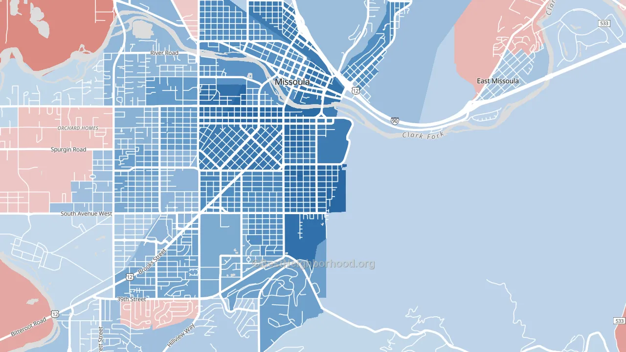
About 62% of adults in University District typically vote, near the U.S. average of about 62%. Among adults in University District, ~49% vote Democratic, ~13% Republican, and ~38% don't vote. The map below shows estimated turnout by block group.
How University District compares
Among neighborhoods within 5 miles, University District leans more Democratic than 12 of 13 neighbors.
University District runs about 79 points more Democratic than Montana as a whole. Montana leans Republican overall, while University District is one of the few Democratic-leaning pockets.
Why University District leans the way it does
This analysis examined 14,881 data points per neighborhood to find what predicts political lean and turnout. The items below are a few correlations that stood out for University District, not a ranked or complete list of what matters most.
Areas with high college attainment vote Democratic. About 70% of adults in University District hold a bachelor's degree, about 41 points above the U.S. average of 28%. A high never-married share predicts Democratic voting, and about 66% of adults in University District have never been married, above 96% of neighborhoods. University District runs against the grain of Montana, a Democratic-leaning pocket in a Republican-leaning state.
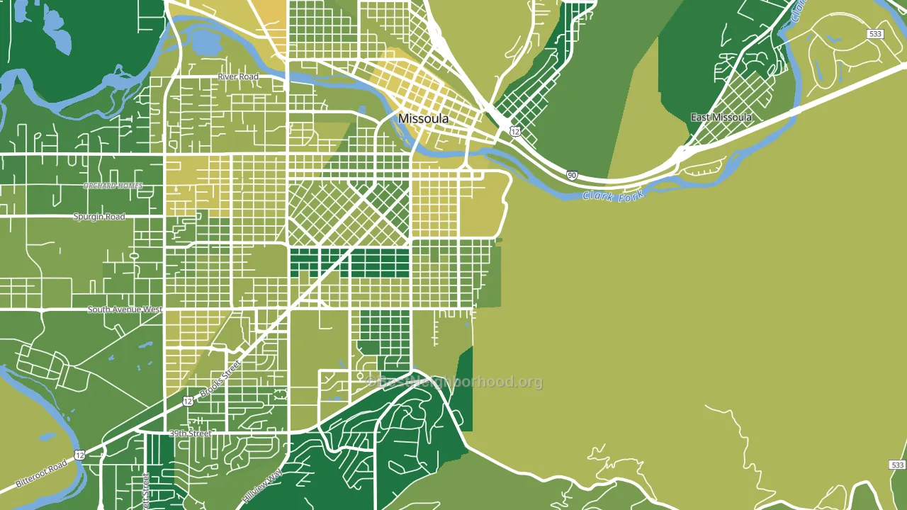
Cholesterol-screening access and voter turnout
Places with low cholesterol-screening access tend to turn out at a lower rate; University District, Missoula, MT sits in the bottom tenth nationally on this measure. Cholesterol screening does not drive turnout; it reflects income, insurance, and healthcare access.
Why turnout in University District looks the way it does
Turnout in University District sits close to the national pattern. Routine healthcare access, homeownership, education, and food security all land near their national averages here. Learn more about the findings and methodology on the political spectrum map.
Nearby Neighborhoods
- Rose Park, Missoula, MT D+59
- Heart of Missoula, Missoula, MT D+51
- Lewis and Clark, Missoula, MT D+47
- Southgate Triangle, Missoula, MT D+26
- Franklin To The Fort, Missoula, MT D+29
- Northside, Missoula, MT D+34
- Emma Dickinson Orchard Homes, Missoula, MT D+31
- Westside, Missoula, MT D+35
- South 39th Street, Missoula, MT D+14
- Upper Rattlesnake, Missoula, MT D+47
Neighborhoods with Similar Populations
- West Somerville, Somerville, MA D+63
- Academy Acres North, Albuquerque, NM D+16
- Fillmore, New Orleans, LA D+59
- Downtown Southfield, Southfield, MI D+87
- South Manchaca, Austin, TX D+52
- Estrella-Goodyear, Goodyear, AZ R+27
- Salisbury Street, Worcester, MA D+35
- Stonegate, Bakersfield, CA R+8
- Oakdale South, Charlotte, NC D+60
- Sonterra-Stone Oak, San Antonio, TX R+2
Sources and methodology
Precinct-level voting records used to fit the model come from Montana Secretary of State, Elections, distributed by the Voting and Election Science Team. Demographic inputs come from the U.S. Census Bureau (ACS 5-year estimates and the 2020 Decennial Census). Health and environmental inputs come from the CDC (PLACES and the Environmental Justice Index). Land cover comes from the USGS and EPA. Election-day and lead-up weather come from PRISM 4km daily grids and the NOAA Global Historical Climatology Network. Mail-voting and election-administration patterns come from the MIT Election Lab's Survey of the Performance of American Elections. Block-group crime detail comes from CrimeGrade. Internet data and modeling support provided by ISPreports.org.
Modeling and analysis by the BestNeighborhood data science team. Full methodology and findings: political spectrum map.
Methodology reviewed by the BestNeighborhood data team. Last updated May 2026.