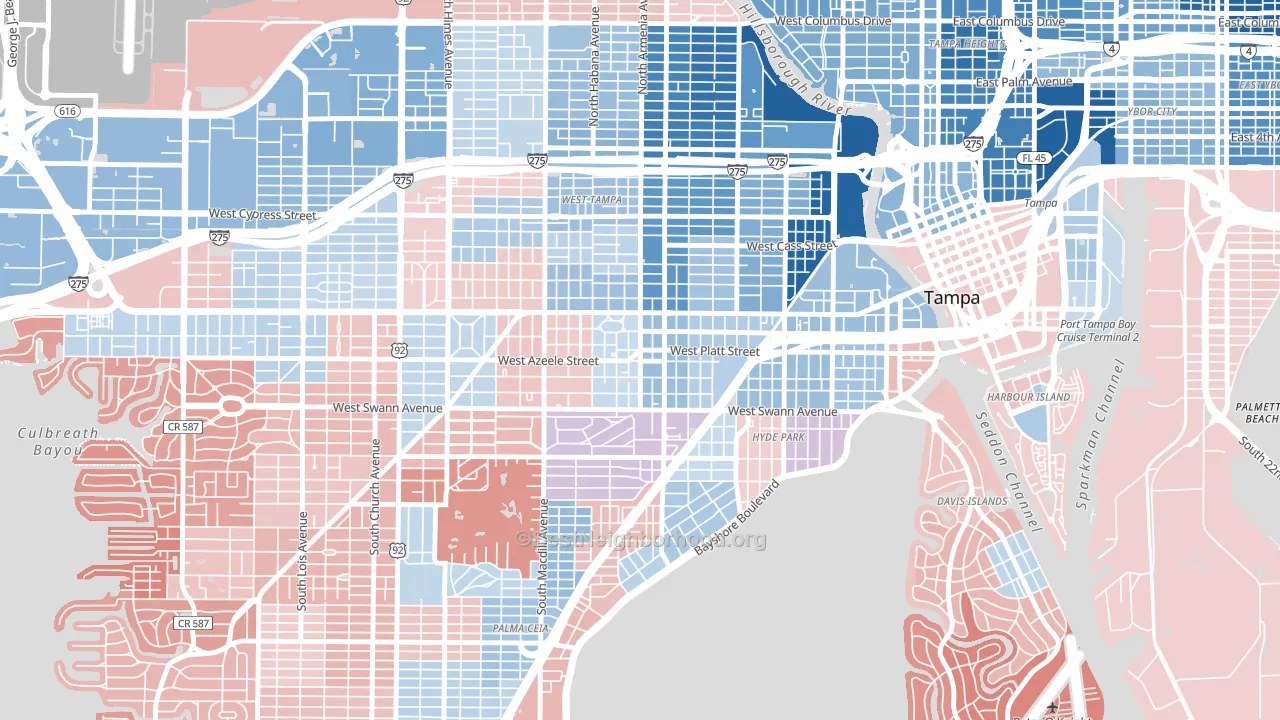
Courier City is a true toss-up. About 50% of voters here vote Democratic and 50% Republican.
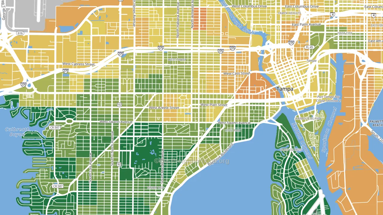
About 52% of adults in Courier City typically vote, below the U.S. average of about 62%. Among adults in Courier City, ~26% vote Democratic, ~26% Republican, and ~48% don't vote. The map below shows estimated turnout by block group.
How Courier City compares
Among neighborhoods within 5 miles, Courier City sits roughly in the middle of the political spectrum, with 19 neighbors leaning further in the place's direction and 9 leaning the other way.
Courier City runs about 12 points more Democratic than Florida as a whole.
Why Courier City leans the way it does
This analysis examined 14,881 data points per neighborhood to find what predicts political lean and turnout. The items below are a few correlations that stood out for Courier City, not a ranked or complete list of what matters most.
Density pulls a place toward Democrats and a high white share pulls it toward Republicans. In Courier City the two roughly cancel.
Never-married share, developed land, and voter turnout
Places that combine a never-married-heavy adult population and a heavily developed built environment tend to turn out at a lower rate, as Courier City, Tampa, FL does.
Why turnout in Courier City looks the way it does
Turnout in Courier City sits close to the national pattern. Learn more about the findings and methodology on the political spectrum map.
Nearby Neighborhoods
- North Hyde Park, Tampa, FL D+12
- Oakford Park, Tampa, FL D+8
- Palma Ceia, Tampa, FL D+5
- Old West Tampa, Tampa, FL D+39
- Downtown Tampa, Tampa, FL D+17
- Northeast MacFarlane, Tampa, FL Even
- Harbour Island, Tampa, FL R+4
- Carver City-Lincoln Gardens, Tampa, FL D+23
- Davis Island, Tampa, FL R+10
- Virginia Park, Tampa, FL D+2
Neighborhoods with Similar Populations
- Rock Creek Lexington Road, Louisville, KY D+35
- Caufield, Oregon City, OR R+3
- Paradise Valley, South San Francisco, CA D+42
- Parkside, Portland, ME D+77
- Downtown Springfield, Springfield, MO D+19
- Haines Corner, Lewiston, ME R+23
- Mission Hills, El Paso, TX D+27
- Lincoln, Vancouver, WA D+44
- Jefferson, San Antonio, TX D+36
- South Park, Seattle, WA D+50
Sources and methodology
Precinct-level voting records used to fit the model come from Florida Division of Elections, distributed by the Voting and Election Science Team. Demographic inputs come from the U.S. Census Bureau (ACS 5-year estimates and the 2020 Decennial Census). Health and environmental inputs come from the CDC (PLACES and the Environmental Justice Index). Land cover comes from the USGS and EPA. Election-day and lead-up weather come from PRISM 4km daily grids and the NOAA Global Historical Climatology Network. Mail-voting and election-administration patterns come from the MIT Election Lab's Survey of the Performance of American Elections. Block-group crime detail comes from CrimeGrade. Internet data and modeling support provided by ISPreports.org.
Modeling and analysis by the BestNeighborhood data science team. Full methodology and findings: political spectrum map.
Methodology reviewed by the BestNeighborhood data team. Last updated May 2026.